
Mixed Data 1
The graphs below show the unemployment rate of citizens in the US with a further classification displaying average salary per week in 2005.
Summarise the data by selecting and reporting the main features and make comparisons where relevant.
Write at least 150 words.

Mixed Data 2
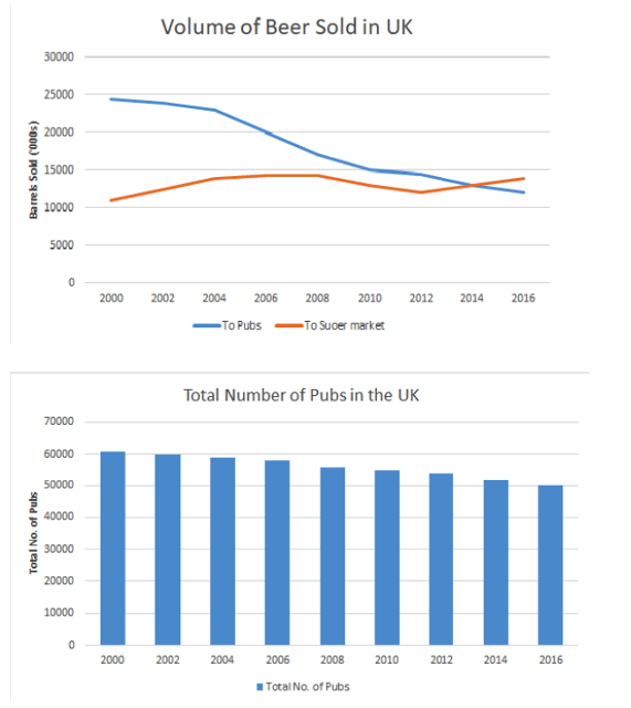
The line charts show the amount of beer sold to pubs and supermarkets over six years, where a bar graph displays the amount of pubs closed over the same period.
Summarise the data by selecting and reporting the main features and make comparisons where relevant.
Write at least 150 words
Mixed Data 2
The line charts show the amount of beer sold to pubs and supermarkets over six years, where a bar graph displays the amount of pubs closed over the same period.
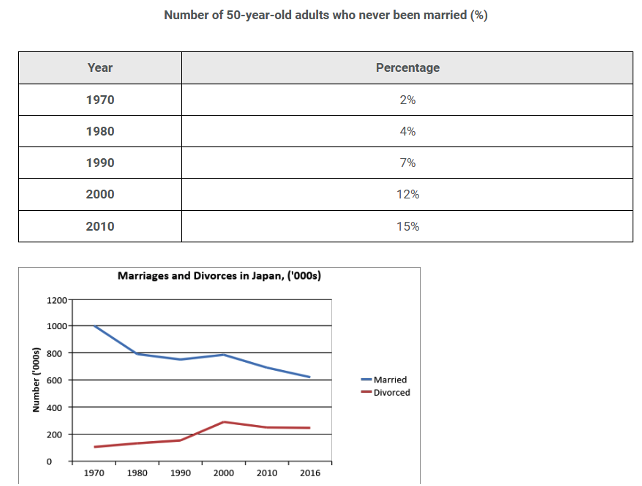
Summarise the data by selecting and reporting the main features and make comparisons where relevant.
Write at least 150 words
Mixed Data 4
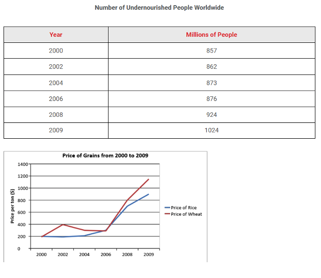
The table shows the number of people (millions) that remain undernourished around the world from 2000 to 2009. The chart displays the global price of two food grains over the same period.
Summarise the data by selecting and reporting the main features and make comparisons where relevant.
Write at least 150 words
Mixed Data 5
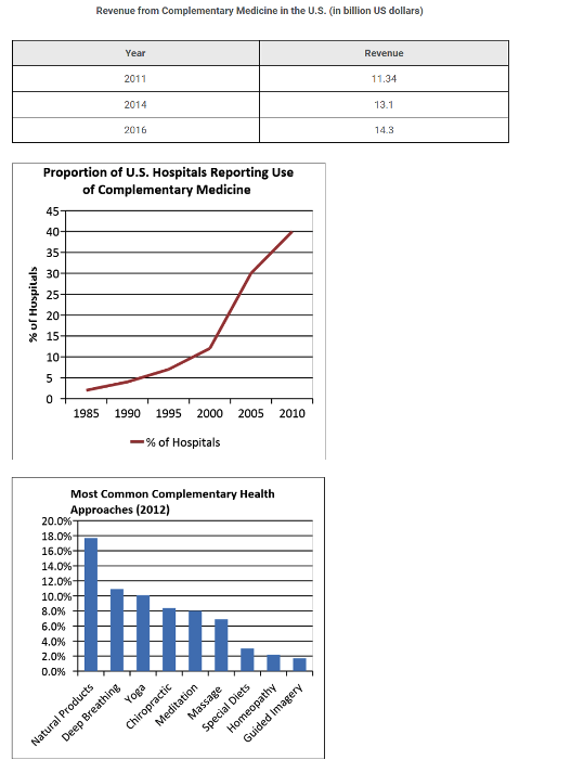
The table shows total revenue created by complementary medicine over three years. The two charts illustrate the number of hospitals offering complementary medicine over twenty five years with a further classification showing which kinds of medicine proved the most popular in 2012.
Summarise the data by selecting and reporting the main features and make comparisons where relevant.
Write at least 150 words
Mixed Data 6
The bar chart below shows the preference for different types of Complementary or Alternative Medicine (CAM) therapies among US adults in 2007. The table lists which therapies where the most popular over two years.
Summarise the data by selecting and reporting the main features and make comparisons where relevant.
Write at least 150 words

Mixed Data 7
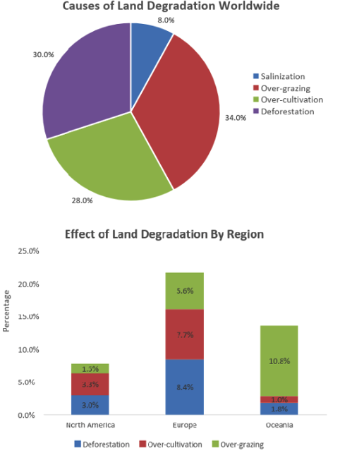
The pie chart below represents the main reasons why agricultural land becomes less productive. The bar chart shows how these causes affected three regions of the world in the 1990s.
Summarise the data by selecting and reporting the main features and make comparisons where relevant.
Write at least 150 words
Mixed Data 8
The pie chart below shows the frequency of U.S. Adults’ online purchasing habits in 2015, while the bar chart shows a further classification denoting online purchasing preferences.
Summarise the data by selecting and reporting the main features and make comparisons where relevant.
Write at least 150 words

Sample Answer Band 9 - 1
The graph below gives information about international migration to the UK, 1999-2008.
Write a report for a university lecturer describing the information shown below. Make comparisons where relevant.
You should write at least 150 words.
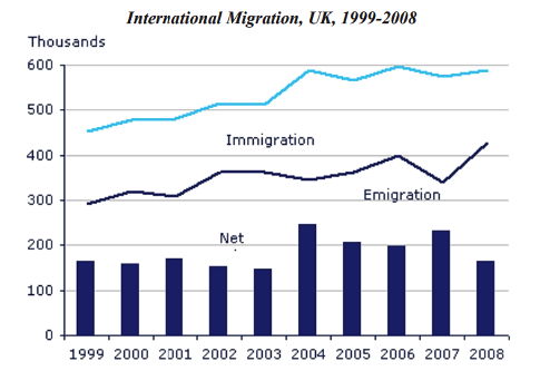
The chart gives information about UK immigration, emigration and net migration between 1999 and 2008.
Both immigration and emigration rates rose over the period shown, but the figures for immigration were significantly higher. Net migration peaked in 2004 and 2007.
In 1999, over 450,000 people came to live in the UK, while the number of people who emigrated stood at just under 300,000. The figure for net migration was around 160,000, and it remained at a similar level until 2003. From 1999 to 2004, the immigration rate rose by nearly 150,000 people, but there was a much smaller rise in emigration. Net migration peaked at almost 250,000 people in 2004.
After 2004, the rate of immigration remained high, but the number of people emigrating fluctuated. Emigration fell suddenly in 2007, before peaking at about 420,000 people in 2008. As a result, the net migration figure rose to around 240,000 in 2007, but fell back to around 160,000 in 2008.
(159 Words)
Sample Answer Band 9 - 2
The graph and table below give information about water use worldwide and water consumption in two different countries.
Write a report for a university lecturer describing the information shown below.
You should write at least 150 words.
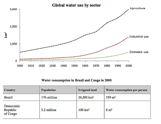
The charts compare the amount of water used for agriculture, industry and homes around the world, and water use in Brazil and the Democratic Republic of Congo.
It is clear that global water needs rose significantly between 1900 and 2000, and that agriculture accounted for the largest proportion of water used. We can also see that water consumption was considerably higher in Brazil than in the Congo.
In 1900, around 500km³ of water was used by the agriculture sector worldwide. The figures for industrial and domestic water consumption stood at around one fifth of that amount. By 2000, global water use for agriculture had increased to around 3000km³, industrial water use had risen to just under half that amount, and domestic consumption had reached approximately 500km³.
In the year 2000, the populations of Brazil and the Congo were 176 million and 5.2 million respectively. Water consumption per person in Brazil, at 359m³, was much higher than that in the Congo, at only 8m³, and this could be explained by the fact that Brazil had 265 times more irrigated land.
(184 Words)
Sample Answer Band 9 - 3
The climograph below shows average monthly temperatures and rainfall in the city of Kolkata.
Write a report for a university lecturer describing the information shown below.
You should write at least 150 words.
The chart compares average figures for temperature and precipitation over the course of a calendar year in Kolkata.
It is noticeable that monthly figures for precipitation in Kolkata vary considerably, whereas monthly temperatures remain relatively stable. Rainfall is highest from July to August, while temperatures are highest in April and May.
Between the months of January and May, average temperatures in Kolkata rise from their lowest point at around 20°C to a peak of just over 30°C. Average rainfall in the city also rises over the same period, from approximately 20mm of rain in January to 100mm in May.
While temperatures stay roughly the same for the next four months, the amount of rainfall more than doubles between May and June. Figures for precipitation remain above 250mm from June to September, peaking at around 330mm in July. The final three months of the year see a dramatic fall in precipitation, to a low of about 10mm in December, and a steady drop in temperatures back to the January average.
(173 words)
Sample Answer Band 9 - 4
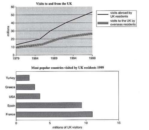
The line graph shows visits to and from the UK from 1979 to 1999, and the bar graph shows the most popular countries visited by UK residents in 1999.
Write a report for a university lecturer describing the information shown below.
You should write at least 150 words.
The line graph illustrates the number of visitors in millions from the UK who went abroad and those that came to the UK between 1979 and 1999, while the bar chart shows which countries were the most popular for UK residents to visit in 1999.
Overall, it can be seen that visits to and from the UK increased, and that France was the most popular country to go to.
To begin, the number of visits abroad by UK residents was higher than for those that came to the UK, and this remained so throughout the period. The figures started at a similar amount, around 10 million, but visits abroad increased significantly to over 50 million, whereas the number of overseas residents rose steadily to reach just under 30 million.
By far the most popular countries to visit in 1999 were France at approximately 11 million visitors, followed by Spain at 9 million. The USA, Greece, and Turkey were far less popular at around 4, 3 and 2 million visitors respectively.
(Words 171)
Sample Answer Band 9 - 5
The bar chart shows the monthly spending in dollars of a family in the USA on three items in 2010.
Write a report for a university lecturer describing the information shown below.
You should write at least 150 words.
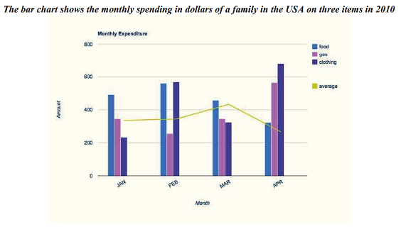
The bar chart depicts the monthly expenditure on food, gas and clothing of a family living in the USA in 2010. Overall, it can be seen that levels of expenditure fluctuated over the period.
To begin, in January the most money was spent on food, at approximately $500 per month. Although expenditure on food increased slightly the following month, it then fell to account for the lowest expenditure of all the items at the end of the period at just over $300.
Gas appeared to follow the opposite pattern to food spending. It started lower at about $350 per month, falling in the following month, and then increasing significantly to finish at just under $600 in April.
Clothing, which at just over $200 accounted for the lowest expenditure at the beginning of the period, fluctuated dramatically over the time frame. After reaching around the same levels as food in February (nearly $600), it dropped markedly in March, then jumped to just under $700 in the final month. With the exception of an increase in March, average spending decreased slightly over the four months.
(183 words)
Sample Answer Band 9 - 6
The line graph shows the cost for watching films. The pie charts show the change in the percentage of market share represented by the three forms.
Write a report for a university lecturer describing the information shown below.
You should write at least 150 words.
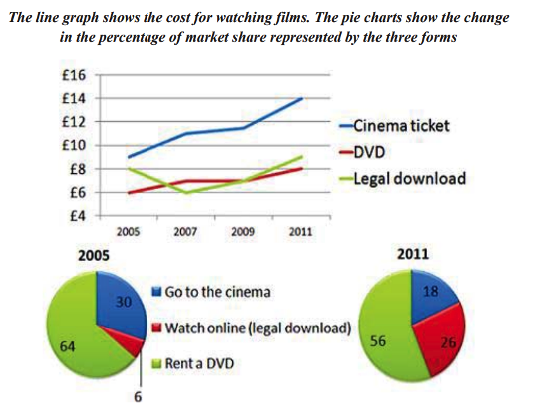
The line graph and pie charts illustrate the cost for watching movies in different formats, as well as the percentage split between type.
The most notable trend with regard cost is that cinema tickets remained the most expensive way to watch a movie from 2005 to 2011, rising to a peak of slightly over £14 a ticket. Over the same period, DVD prices also increased by £2, from £6 to £8. Downloaded movies were more expensive than DVDs in 2005; this changed in 2007 when they became the cheapest format, yet by 2011, the price had risen to £9.
In 2005, the majority of people opted to hire DVDs, with those going to the cinema accounting for less than one third of the total, and movies from the internet representing only 6%. By 2011, however, both going to the cinema and renting had fallen as downloaded movies increased to just over one quarter of the market.
Overall, it is clear that although prices increased on average for all three forms, an increasing percentage of people chose to download movies.
(179 words)
Sample Answer Band 9 - 7
The charts show information about the number of kilometres travelled in an average month and the distribution of vehicle types in Britain.
Write a report for a university lecturer describing the information shown below.
You should write at least 150 words.
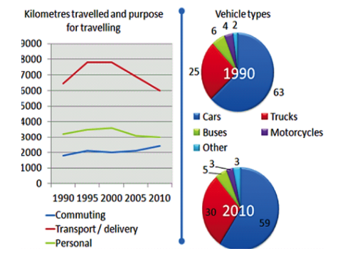
Data is given for the distance travelled for three different reasons, as well as charts indicating the percentage of vehicle types in the UK in 1990 and 2010.
The most significant trend is that the most kilometres were travelled for transporting and delivery reasons. In 1990, this figure was approximately 6500 kilometres, rising to almost 8000 kilometres by 1995 and 2000 but falling to 6,000 by 2010.
Personal travel accounted for about 1,200 kilometres a month more than commuting for 1990 to 2000, but commuting distances increased from 2000 to be within approximately 700 kilometres of personal driving, with the former being on 3,000 and the latter being around 2,300.
The pie charts indicate that in the twenty year difference, the percentage of cars fell by 4% while the number of trucks increased by 5%. Over the same period, buses and motorcycles both fell by 1% while the category labelled 'other' increased by 1%.
Overall, it is clear that there was a number of changes in the distance travelled and type of vehicles from 1990 to 2010.
(177 words)
Sample Answer Band 9 - 8
The charts illustrate how recycling is carried out in Eutopia, and the pie charts show the percentage of recycled and unrecycled waste.
Write a report for a university lecturer describing the information shown below.
You should write at least 150 words.
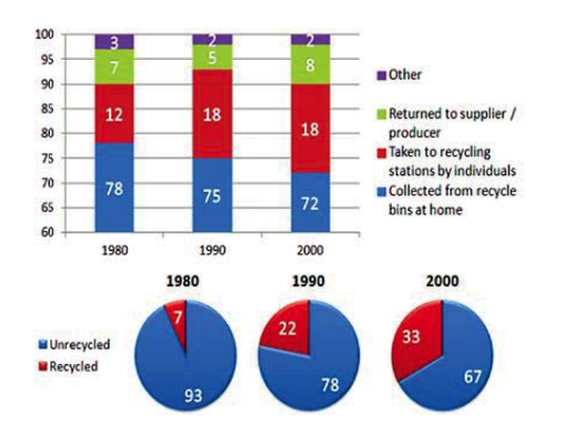
The charts provide information about recycling in Eutopia in three different years, namely 1980, 1990 and 2000.
The column chart shows that the percentage of recycled waste collected from people's homes decreased from over three quarters to just over 70%. The percentage of recycled material taken to allocated areas increased between 1980 and 1990 but remained steady at 18% in 2000.
The amount of recycling done from items that were returned to their original starting point decreased in 1990 by 2%, but then increased to 8% in 2000. The category labelled 'other' decreased by 1% then remained stable at 2% for the final two given years.
The pie charts indicate a threefold increase in the amount of waste recycled between 1990 and 1990 from 7% up to 22%. In 2000, this figure had continued to increase, although at a less dramatic rate, finishing at one third of waste being recycled.
Overall, it can be seen that recycling increased over the time displayed, while the percentage collected from each house gradually decreased.
(171 words)