
Table 1
You should spend about 20 minutes on this task.
The table below shows the sales at a small restaurant in a downtown business district.
Summarise the information by selecting and reporting the main features, and make comparisons where relevant.
You should write at least 150 words.
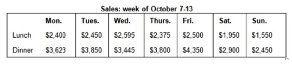
Table 2
You should spend about 20 minutes on this task.
The two tables below show the number of international students from different resource countries in Canada and the USA in two school years.
Summarise the information by selecting and reporting the main features, and make comparisons where relevant.
You should write at least 150 words.
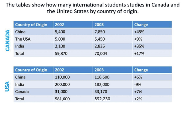
Table 3
You should spend about 20 minutes on this task.
The table below shows the results of surveys in 2000, 2005 and 2010 about one university.
Summarise the information by selecting and reporting the main features, and make comparisons where relevant.
You should write at least 150 words.
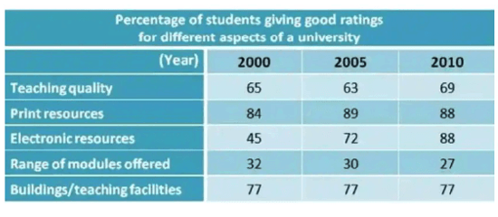
Table 4
The table below gives information about UK independent films.
Summarise the information by selecting and reporting the main features, and make comparisons where relevant.
You should write at least 150 words.
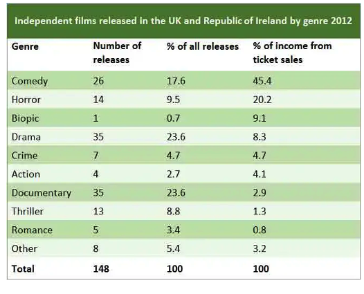
Table 5
The table below shows the percentage participation of women in senior management in three companies bewteeb 1975 and 2015.
Summarise the information by selecting and reporting the main features, and make comparisons where relevant.
You should write at least 150 words.
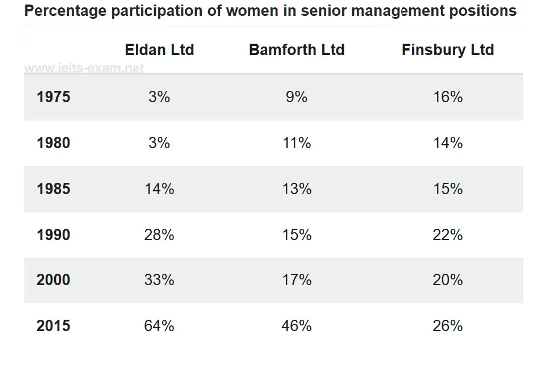
Table 6
The table below shows the number of mobile phones and personal computers per thousand people in six different countries in 2003.
Summarise the information by selecting and reporting the main features, and make comparisons where relevant.
You should write at least 150 words.
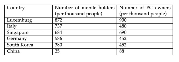
Table 7
The tables below give the distribution of world population in 1950 and 2000, with an estimate of the situation in 2050.
Summarize the information by selecting and reporting the main features, and make comparisons where relevant.
Write at least 150 words.
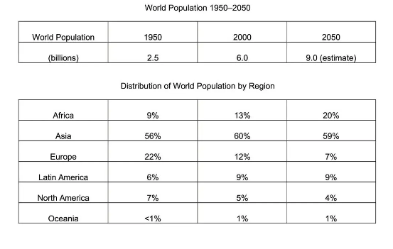
Table 8
The table below gives information about salaries of secondary/high school teachers in five countries in 2009.
Summarize the information by selecting and reporting the main features, and make comparisons where relevant.
Write at least 150 words.
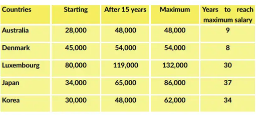
Table 9
The table shows the Proportions of Pupils Attending Four Secondary School Types Between Between 2000 and 2009.
Summarize the information by selecting and reporting the main features and make comparisons where relevant.
Write at least 150 words.
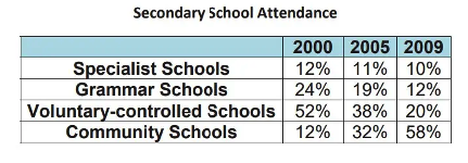
Table 10
The table below shows the monthly expenditure of an Australian family in 1991 and 2001.
Summarize the information by selecting and reporting the main features and make comparisons where relevant.
Write at least 150 words.
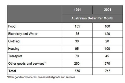
Table 11
The table illustrates the breakdown of scores for the IELTS general test in 2010. The data has been calibrated in numbers.
Summarize the information by selecting and reporting the main features and make comparisons where relevant.
Write at least 150 words.

Table 12
The table below shows sales made by a coffee shop in an office building on a typical weekday.
Summarise the information by selecting and reporting the main features, and make comparisons where relevant.
You should write at least 150 words
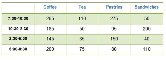
Table 13
The table below provide information on rental charges and salaries in three areas of London. Write a report for a university lecturer describing the information shown below.
You should write at least 150 words.

Table 14
You should spend about 20 minutes on this task. The table below shows the proportion of different categories of families living in poverty in Australia in 1999.
Summarise the information by selecting and reporting the main features, and make comparisons where relevant.
You should write at least 150 words. Give reasons for your answer and include any relevant examples from your own knowledge or experience.
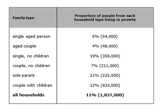
Table 15
The take below gives information about the underground railway systems in six cities.
Summarise the information by selecting and reporting the main features, and make comparisons where relevant.
You should write at least 150 words.
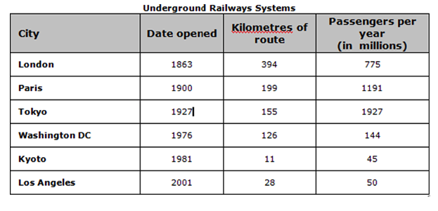
Table 16
You should spend about 20 minutes on this task.
The following table gives statistics showing the aspects of quality of life in five countries.
Summarise the information by selecting and reporting the main features and make comparisons where relevant.
Write at least 150 words.
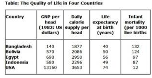
Table 17
The table gives information about department and online stores in Australia in 2011.
Summarise the information by selecting and reporting the main features, and make comparisons where relevant.
Write at least 150 words
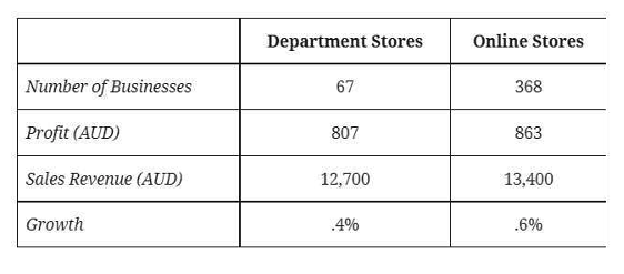
Table 18
The table details the international tourist arrivals in millions in 8 countries in 2009 and 2010 and the changes (in percentages).
Summarise the information by selecting and reporting the main features, and make comparisons where relevant.
Write at least 150 words
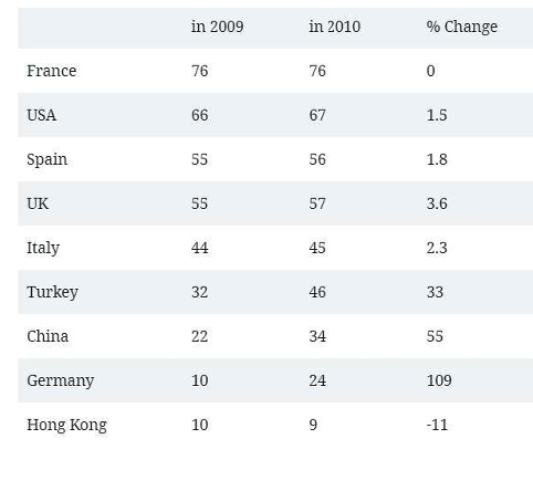
Table 18
The table below shows the changes in exports in HK billions between 2009 and 2010.
Summarise the information by selecting and reporting the main features, and make comparisons where relevant.
Write at least 150 words
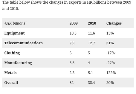
Table 19
The table below illustrates weekly consumption by age group of dairy products in a European country.
Summarise the information by selecting and reporting the main features, and make comparisons where relevant.
Write at least 150 words
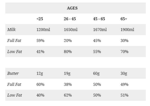
Table 20
The table below shows the number of visitors in the UK and their average spending from 2003 to 2008.
Summarise the information by selecting and reporting the main features, and make comparisons where relevant.
Write at least 150 words
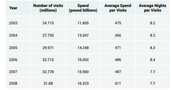
Table 21
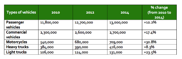
The Table gives information about five types of vehicles registered in Australia in 2010, 2012, and 2014.
Summarise the information by selecting and reporting the main features, and make comparisons where relevant.
Write at least 150 words
Sample Answer Band 9 - 1
The table below gives information on average hours and minutes spent by UK males and females on different daily activities.
Write a report for a university lecturer describing the information shown below. Make comparisons where relevant.
You should write at least 150 words
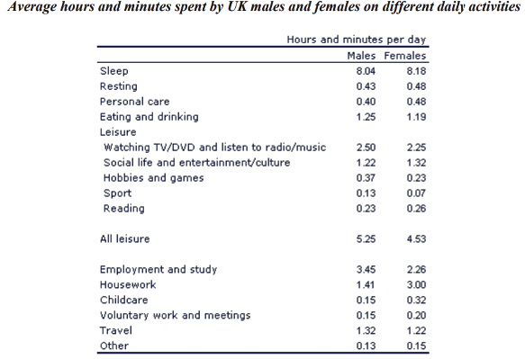
The table compares the average amount of time per day that men and women in the UK spend doing different activities.
It is clear that people in the UK spend more time sleeping than doing any other daily activity. Also, there are significant differences between the time spent by men and women on employment/study and housework.
On average, men and women in the UK sleep for about 8 hours per day. Leisure takes up the second largest proportion of their time. Men spend 5 hours and 25 minutes doing various leisure activities, such as watching TV or doing sport, while women have 4 hours and 53 minutes of leisure time.
It is noticeable that men work or study for an average of 79 minutes more than women every day. By contrast, women spend 79 minutes more than men doing housework, and they spend over twice as much time looking after children.
(151 words)
Sample Answer Band 9 - 2
The table below gives information about the underground railway systems in six cities.
Write a report for a university lecturer describing the information shown below. Make comparisons where relevant.
You should write at least 150 words
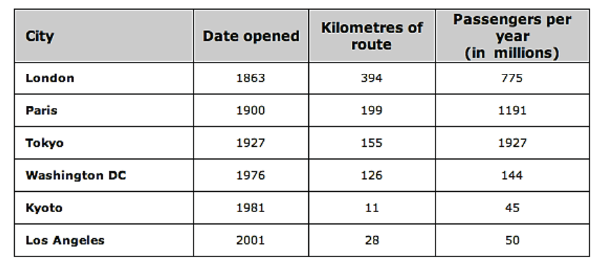
The table shows data about the underground rail networks in six major cities.
The table compares the six networks in terms of their age, size and the number of people who use them each year. It is clear that the three oldest underground systems are larger and serve significantly more passengers than the newer systems.
The London underground is the oldest system, having opened in 1863. It is also the largest system, with 394 kilometres of route. The second largest system, in Paris, is only about half the size of the
London underground, with 199 kilometres of route. However, it serves more people per year. While only third in terms of size, the Tokyo system is easily the most used, with 1927 million passengers per year.
Of the three newer networks, the Washington DC underground is the most extensive, with 126 kilometres of route, compared to only 11 kilometres and 28 kilometres for the Kyoto and Los Angeles systems. The Los Angeles network is the newest, having opened in 2001, while the Kyoto network is the smallest and serves only 45 million passengers per year.
(185 Words)
Sample Answer Band 9 - 3
The table below shows the proportion of different categories of families living in poverty in Australia in 1999.
Write a report for a university lecturer describing the information shown below. Make comparisons where relevant.
You should write at least 150 words
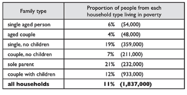
The table gives information about poverty rates among six types of household in Australia in the year 1999.
It is noticeable that levels of poverty were higher for single people than for couples, and people with children were more likely to be poor than those without. Poverty rates were considerably lower among elderly people.
Overall, 11% of Australians, or 1,837,000 people, were living in poverty in 1999. Aged people were the least likely to be poor, with poverty levels of 6% and 4% for single aged people and aged couples respectively.
Just over one fifth of single parents were living in poverty, whereas only 12% of parents living with a partner were classed as poor. The same pattern can be seen for people with no children: while 19% of single people in this group were living below the poverty line, the figure for couples was much lower, at only 7%.
(150 Word)
Sample Answer Band 9 - 4
The percentage of people using various mobile phone features.
Write a report for a university lecturer describing the information shown below. Make comparisons where relevant.
You should write at least 150 words
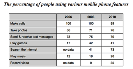
The table compares the percentages of people using different functions of their mobile phones between 2006 and 2010.
Throughout the period shown, the main reason why people used their mobile phones was to make calls. However, there was a marked increase in the popularity of other mobile phone features, particularly the Internet search feature.
In 2006, 100% of mobile phone owners used their phones to make calls, while the next most popular functions were text messaging (73%) and taking photos (66%). By contrast, less than 20% of owners played games or music on their phones, and there were no figures for users doing Internet searches or recording video.
Over the following 4 years, there was relatively little change in the figures for the top three mobile phone features. However, the percentage of people using their phones to access the Internet jumped to 41% in 2008 and then to 73% in 2010. There was also a significant rise in the use of mobiles to play games and to record video, with figures reaching 41% and 35% respectively in 2010.
(178 words)
Sample Answer Band 9 - 5
The table shows the Proportions of Pupils Attending Four Secondary School Types Between 2000 and 2009.
Write a report for a university lecturer describing the information shown below. Make comparisons where relevant.
You should write at least 150 words
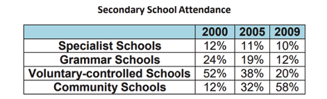
The table illustrates the percentage of school children attending four different types of secondary school from 2000 to 2009. It is evident that the specialist, grammar and voluntary-controlled schools experienced declines in numbers of pupils, whereas the community schools became the most important providers of secondary school education during the same period.
To begin, the proportion in voluntary-controlled schools fell from just over half to only 20% or one fifth from 2000 to 2009. Similarly, the relative number of children in grammar schools -- just under one quarter -- dropped by half in the same period. As for the specialist schools, the relatively small percentage of pupils attending this type of school (12%) also fell, although not significantly.
However, while the other three types of school declined in importance, the opposite was true in the case of community schools. In fact, while only a small minority of 12% were educated in these schools in 2000, this figure increased to well over half of all pupils during the following nine years.
(Words 170)
Sample Answer Band 9 - 6
The table gives information about the average hours spent on the Internet by European people of different age groups.
Write a report for a university lecturer describing the information shown below. Make comparisons where relevant.
You should write at least 150 words
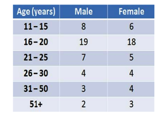
The table shows the median number of weekly hours various age groups in Europe spend on the internet.
The most striking point to note is that Internet usage is at its highest for those aged between 16 and 20, with the figure for males being 19 hours and females just one hour less. These figures represent an increase of treble the previous age category for women and over two times more for males.
From 21 onwards, the hours spent reduced dramatically. By the ages of 26 to 30, males and females spend the same amount of time online with 4 hours each, after which females reportedly spend slightly longer online than males for the remaining two categories, falling to only 3 hours for men and 4 hours for women for those aged 51 or older.
Overall, it can be seen that the highest period of internet usage for both male and female was the age range of 16 to 20.
(160 words)
Sample Answer Band 9 - 7
The table shows the percentage of people with mobile phones who use various features on their phone.
Write a report for a university lecturer describing the information shown below. Make comparisons where relevant.
You should write at least 150 words
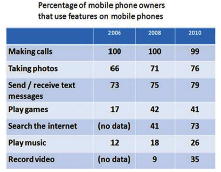
The table illustrates the various functions available on mobile phones, showing the percent of users that take advantage of these capabilities over three different years.
The most striking point is that with the exception of a slight fall in 2010, all owners use their mobile phone to telephone people. The second most common use is for text messaging, which steadily increased from just under three quarter of all users in 2006 to nearly four fifths of users in 2010.
Using the phone as a camera increased by 5 percent each year, rising to a peak of 76% in 2010. Playing games on the phone increased dramatically between 2006 and 2008, but then fell slightly in 2010 to end at 41%.
The largest increase in the table is between 2008 and 2010 for those browsing the internet, but no data is given for 2006. Video and music use also increased, with video overtaking music in 2010.
In total, the functions used on mobiles all increased over the years with the exception of games and making calls.
(175 words)
Sample Answer Band 9 - 8
The table shows the number of people in Canada in each earning level.
Write a report for a university lecturer describing the information shown below. Make comparisons where relevant.
You should write at least 150 words
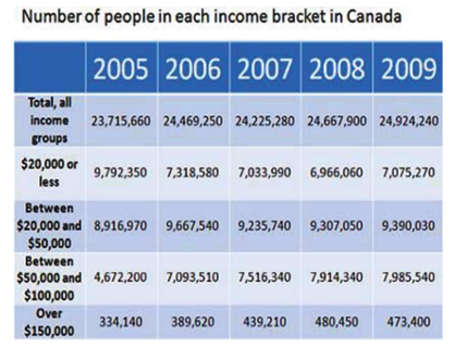
The table details income levels in Canada and how many citizens were included in each income bracket from 2005 to 2009.
In 2005, the number of people in each income level reduced the higher the income, with nearly 10 million earning $20,000 or less, falling to only slightly above one third of a million earning over $150,000.
By 2006, the pattern changed as the number of people with the lowest income fell by nearly one quarter, whereas those earning between $20,000 and $50,000 increased by almost one million and those in the next income level increased dramatically to over 7 million. There was also an increase in the number of people in the highest income bracket, which rose by over 50,000.
In 2007, the largest increase in numbers was observed in those earning between $50,000 and $100,000, and in 2008 and 2009, figures remained relatively stable, with those earning between $20,000 and $50,000 representing the majority.
Overall, there were variations in the number of people in each income level.
(170 words)
Sample Answer Band 9 - 9
The chart shows the average life expectancy for males and females in 1990, 1950 and 1990
Write a report for a university lecturer describing the information shown below. Make comparisons where relevant.
You should write at least 150 words
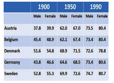
The table provides data on the median number of years people from 5 different countries lived in three different time periods.
The most notable point is that in all countries, women generally lived longer than men, and in most cases the gap between the genders increases from 1900 to 1990.
The countries that had the longest average life span in 1900 and 1950 were Denmark and Sweden, although by 1990, Danish life expectancy fell to the lowest age of all countries for both male and female, with figures of 72.6 and 78.8 respectively.
The variations between Austria, Belgium and Germany closed from nearly ten years difference at their peak in 1900 to only one third of a year difference for women and one tenth of a year for men.
Overall, it can be seen that statistically, Swedish people have had the highest life expectancy for both male and female for all three time periods.
(154 words)