
Bar Chart 1
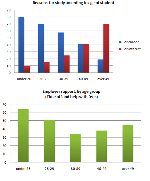
The charts below show the main reasons for study among students of different age groups and the amount of support they received from employers.
Summarise the information by selecting and reporting the main features, and make comparisons where relevant.
- You should write at least 150
- You should spend about 20 minutes on this
Bar Chart 2
The graph below gives information about the preferred leisure activities of Australian children. Write a report for a university lecturer describing the information shown.
You should write at least 150 words.

Bar Chart 3
The bar chart below shows the results of a survey conducted by a personnel department at a major company. The survey was carried out on two groups of workers: those aged from 18-30 and those aged 45-60, and shows factors affecting their work performance.
Write a report for a university lecturer describing the information shown below.
You should write at least 150 words.

Bar Chart 4
The chart below shows estimated world literacy rates by region and by gender for the year 2000. Write a report for a university lecturer describing the information below.
You should write at least 150 words.

Bar Chart 5
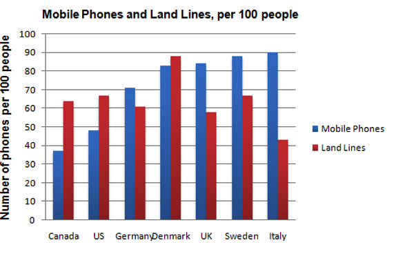
The chart shows the number of mobile phones and landlines per 100 people in selected countries. Write a report for a university lecturer describing the information given.
You should write at least 150 words.
Bar Chart 6
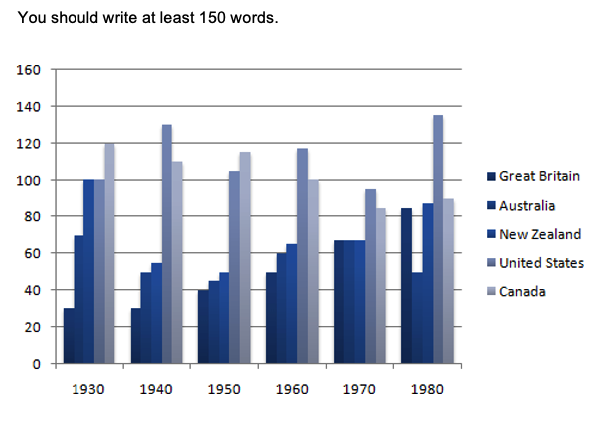
The table below shows the figures for imprisonment in five countries between 1930 and 1980. Write a report for a university, lecturer describing the information shown below.
You should write at least 150 words.
Bar Chart 7
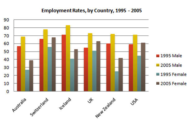
The graph above show information of employment rates across 6 countries in 1995 and 2005.
Summarize the information by choosing and describe the main idea, and make comparisons where appropriate.
You should write at least 150 words.
Bar Chart 8
The graph shows Internet Usage in Taiwan by Age Group, 1998-2000.
Summarise the information by selecting and reporting the main features, and make comparisons where relevant.
- You should write at least 150
- You should spend about 20 minutes on this

Bar Chart 9
Write a report for a university lecturer describing the information below.
- You should write at least 150
- You should spend about 20 minutes on this

Bar Chart 10
The graph shows estimated oil production capacity for several Gulf countries between 1990 and 2010.
Summarise the information by selecting and reporting the main features, and make comparisons where relevant.
- You should write at least 150
- You should spend about 20 minutes on this

Bar Chart 11
The chart below shows information about Heart Attacks by Age and Gender in USA.
Summarise the information by selecting and reporting the main features, and make comparisons where relevant.
- You should write at least 150
- You should spend about 20 minutes on this

Bar Chart 12
The chart below shows the amount spent on six consumer goods in four European countries.
Write a report for a university lecturer describing the information shown below.
Summarise the information by selecting and reporting the main features, and make comparisons where relevant.
- You should write at least 150
- You should spend about 20 minutes on this

Bar Chart 13
Write a report describing the information in the graph below.
Summarise the information by selecting and reporting the main features, and make comparisons where relevant.
- You should write at least 150
- You should spend about 20 minutes on this

Bar Chart 14
Write a report for a university lecturer describing the information below.
Summarise the information by selecting and reporting the main features, and make comparisons where relevant.
- You should write at least 150
- You should spend about 20 minutes on this

Bar Chart 15
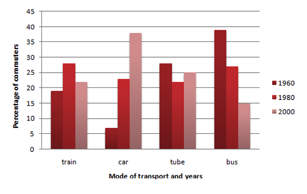
The graph below shows the different modes of transport used to travel to and from work in one European city in 1960, 1980 and 2000.
Write a report for a university lecturer describing the information below.
Summarise the information by selecting and reporting the main features, and make comparisons where relevant.
- You should write at least 150
- You should spend about 20 minutes on this
Bar Chart 16
The bar chart below describes some changes about the percentage of people were born in Australia and who were born outside Australia living in urban, rural and town between 1995 and 2010.
Summarise the information by selecting and reporting the main features, and make comparisons where relevant.
Write at least 150 words

Bar Chart 17
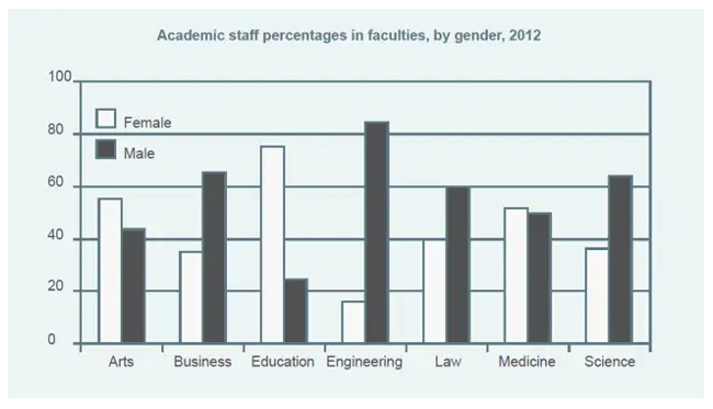
The graph shows the percentage of male and female academic staff members across the faculties of a major university in 2012.
Summarise the information by selecting and reporting the main features, and make comparisons where relevant.
Write at least 150 words
Bar Chart 18
The chart shows the number of international students studying at a UK university between 1995 and 2015.
Summarise the information by selecting and reporting the main features, and make comparisons where relevant.
Write at least 150 words

Bar Chart 19
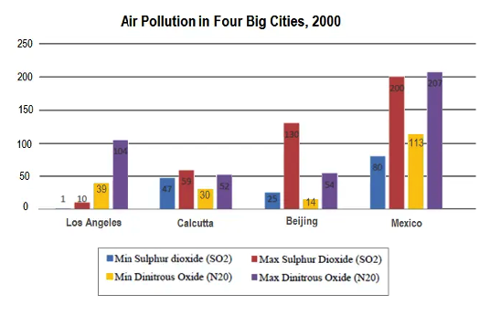
The chart shows the average daily minimum and maximum levels of air pollutants in 4 cities 2000.
Summarise the information by selecting and reporting the main features, and make comparisons where relevant.
Write at least 150 words
Bar Chart 20
The chart below shows the number of men and women in further education in Britain in three periods and whether they were studying full-time or part-time.
Summarise the information by selecting and reporting the main features, and make comparisons where relevant.
Write at least 150 words

Bar Chart 21
The chart below gives information about how families in one country spend their weekly income in 1968 and in 2018
Summarise the information by selecting and reporting the main features, and make comparisons where relevant.
Write at least 150 words

Bar Chart 22
The graph compares the percentage of international and the percentage of UK students gaining second class degrees or better at a major UK university.
Summarise the information by selecting and reporting the main features, and make comparisons where relevant.
Write at least 150 words

Bar Chart 23
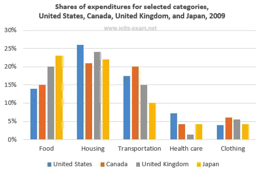
The bar chart shows shares of expenditures for five major categories in the United States, Canada, the United Kingdom, and Japan in the year 2009.
Summarise the information by selecting and reporting the main features, and make comparisons where relevant.
Write at least 150 words
Bar Chart 24
The chart below shows how frequently people in the USA ate in fast food restaurants between 2003 and 2013.
Summarise the information by selecting and reporting the main features, and make comparisons where relevant.
Write at least 150 words

Bar Chart 25
The chart above shows the number of men and women in further education in Britain in three periods and whether they were studying full-time or part-time.
Summarise the information by selecting and reporting the main features, and make comparisons where relevant.
Write at least 150 words

Sample Answer Band 9 - 1
The chart below shows information about changes in average house prices in five different cities between 1990 and 2002 compared with the average house prices in 1989.
Write a report for a university lecturer describing the information shown below. Make comparisons where relevant.
You should write at least 150 words
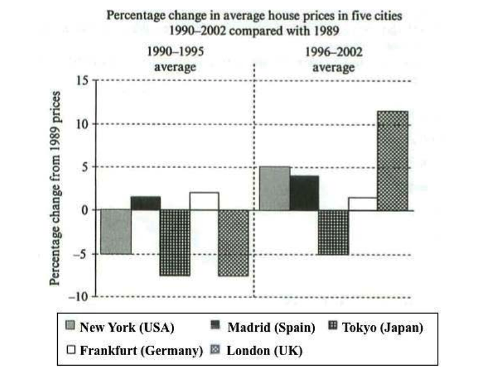
The bar chart compares the cost of an average house in five major cities over a period of 13 years from 1989.
We can see that house prices fell overall between 1990 and 1995, but most of the cities saw rising prices between 1996 and 2002. London experienced by far the greatest changes in house prices over the 13-year period.
Over the 5 years after 1989, the cost of average homes in Tokyo and London dropped by around 7%, while New York house prices went down by 5%. By contrast, prices rose by approximately 2% in both Madrid and Frankfurt.
Between 1996 and 2002, London house prices jumped to around 12% above the 1989 average. Homebuyers in New York also had to pay significantly more, with prices rising to 5% above the 1989 average, but homes in Tokyo remained cheaper than they were in 1989. The cost of an average home in Madrid rose by a further 2%, while prices in Frankfurt remained stable.
(165 Words)
Sample Answer Band 9 - 2
The chart below shows the total number of Olympic medals won by twelve different countries.
Write a report for a university lecturer describing the information shown below. Make comparisons where relevant.
You should write at least 150 words
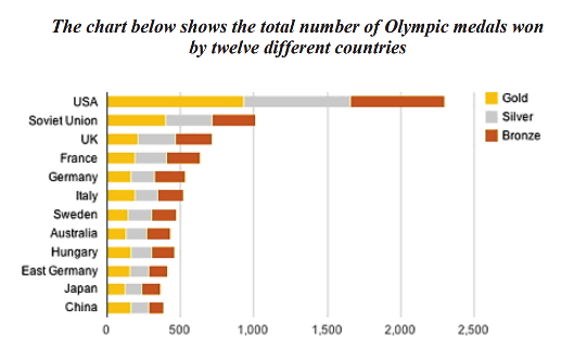
The bar chart compares twelve countries in terms of the overall number of medals that they have won at the Olympic Games.
It is clear that the USA is by far the most successful Olympic medal winning nation. It is also noticeable that the figures for gold, silver and bronze medals won by any particular country tend to be fairly similar.
The USA has won a total of around 2,300 Olympic medals, including approximately 900 gold medals, 750 silver and 650 bronze. In second place on the all-time medals chart is the Soviet Union, with just over 1,000 medals. Again, the number of gold medals won by this country is slightly higher than the number of silver or bronze medals.
Only four other countries - the UK, France, Germany and Italy - have won more than 500 Olympic medals, all with similar proportions of each medal colour. Apart from theUSA and the Soviet Union, China is the only other country with a noticeably higher proportion of gold medals (about 200) compared to silver and bronze (about 100 each).
(178 words)
Sample Answer Band 9 - 3
The bar graph shows the global sales (in billions of dollars) of different types of digital games between 2000 and 2006.
Write a report for a university lecturer describing the information shown below. Make comparisons where relevant.
You should write at least 150 words
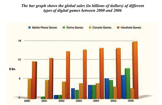
The bar chart compares the turnover in dollars from sales of video games for four
different platforms, namely mobile phones, online, consoles and handheld devices,
from 2000 to 2006.
It is clear that sales of games for three out of the four platforms rose each year,
leading to a significant rise in total global turnover over the 7-year period. Sales
figures for handheld games were at least twice as high as those for any other
platform in almost every year.
In 2000, worldwide sales of handheld games stood at around $11 billion, while
console games earned just under $6 billion. No figures are given for mobile or online
games in that year. Over the next 3 years, sales of handheld video games rose by
about $4 billion, but the figure for consoles decreased by $2 billion. Mobile phone
and online games started to become popular, with sales reaching around $3 billion in
In 2006, sales of handheld, online and mobile games reached peaks of 17, 9 and 7
billion dollars respectively. By contrast, turnover from console games dropped to its
lowest point, at around $2.5 billion.
(187 words)
Sample Answer Band 9 - 4
The chart shows British Emigration to selected destinations between 2004 and 2007.
Write a report for a university lecturer describing the information shown below. Make comparisons where relevant.
You should write at least 150 words.
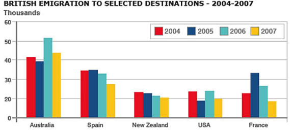
The bar chart shows the number of British people who emigrated to five destinations over the period 2004 to 2007. It is evident from the chart that throughout the period, the most popular place to move to was Australia.
Emigration to Australia stood at just over 40,000 people in 2004, which was approximately 6,000 higher than for Spain, and twice as high as the other three countries. Apart from a jump to around 52,000 in 2006, it remained around this level throughout the period.
The next most popular country for Britons to move to was Spain, though its popularity declined over the time frame to finish at below 30,000 in 2007. Despite this, the figure was still higher than for the remaining three countries. Approximately 20,000 people emigrated to New Zealand each year, while the USA fluctuated between 20-25,000 people over the period.
Although the number of visitors to France spiked to nearly 35,000 in 2005, it was the country that was the least popular to emigrate to at the end of the period, at just under 20,000 people.
(Words 179)
Sample Answer Band 9 - 5
The bar chart shows the number of times per week (in 1000s), over five weeks, that three computer packages were downloaded from the internet.
Write a report for a university lecturer describing the information shown below. Make comparisons where relevant.
You should write at least 150 words.

The bar chart illustrates the download rate per week of ActiveX, Java and Net computer packages over a period of five weeks. It can clearly be seen that ActiveX was the most popular computer package to download, whilst Net was the least popular of the three.
To begin, ActiveX and Java showed a similar pattern, with both gradually increasing from week 1 to week 5. However, the purchases of Active X remained significantly higher than for the other product over this time frame. In week 1, purchases of ActiveX stood at around 75,000, while those for Java were about 30,000 lower. With the exception of a slight fall in week 4, downloading of ActiveX kept increasing until it reached a peak in the final week of just over 120,000. Java also increased at a steady rate, finishing the period at 80,000.
The product that was downloaded the least was Net. This began at slightly under 40,000, and, in contrast to the other two products, fell over the next two weeks to reach a low of approximately 25,000. It then increased sharply over the following two weeks to finish at about 50,000, which was well below that of ActiveX.
(Words 197)
Sample Answer Band 9 - 6
The bar chart shows the typical weekday for students in three different countries.
Write a report for a university lecturer describing the information shown below. Make comparisons where relevant.
You should write at least 150 words.

The bar chart illustrates the breakdown of a typical 24 hour period on a school day for students in 3 different countries, namely the UK, Japan and Germany.
Most notable is the amount of hours spent studying by Japanese children. At just over 13 hours a day, this is over 5 hours longer than in the UK and 4 hours above the average number for Germany.
With regards sleeping, UK schoolchildren spend the most time in bed, with approximately 8.5 hours a day. Germany is not far behind at about 8 hours, but students in Japan average at least one hour less sleep at 7 hours.
The UK and Germany share an equal 7 hours a day on relaxing or other pursuits, whereas Japanese schoolchildren have only 4 hours.
In total, it is clear that despite a few minor differences, Germany and the UK have similar statistics, whereas Japan focuses much more on studying.
(154 words)
Sample Answer Band 9 - 7
The chart shows ways that schoolchildren get to school in three different countries.
Write a report for a university lecturer describing the information shown below. Make comparisons where relevant.
You should write at least 150 words.

The chart presents information about how pupils in three different countries travel to school, separated into 6 different categories.
For the United States and the United Kingdom, the majority of students travel by car to school, with figures of 40% and 39% respectively. In Australia only a quarter of students use this mode of transport.
The school bus is the most common method of getting to school in Australia; in the USA the number is only slightly behind those travelling by car. Less than a quarter use the school bus in the UK. Almost four times as many Australian students walked to school compared to the USA, with the UK being closer to Australia at 15%.
The remaining three categories showed only slight differences between the countries, with public transport being followed by cycling, and finally a category marked as 'other', which represents only about one twentieth of the total in each country.
Overall, there are differences between the countries, but the school bus and cars represent the most common ways for students to travel to school.
(178 words)
Sample Answer Band 9 - 8
The chart shows the percentage of people who have moved house either in the last 3 years, between 3 to 5 years or not within the last 5 years.
Write a report for a university lecturer describing the information shown below. Make comparisons where relevant.
You should write at least 150 words.
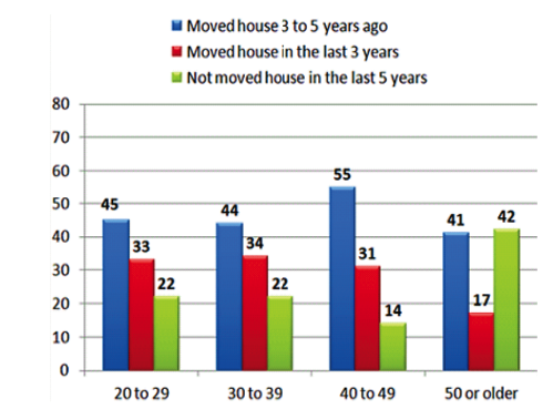
The chart illustrates the breakdown between people who have changed address or remained in the same house, with the numbers split between those who have moved within 5 years, within 3 years or not moved for at least 5 years.
Those in their twenties and thirties have less than a quarter of people living in the same home for more than 5 years and those who moved house three to 5 years back being the highest.
Those aged between 40 and 49 had the highest figure for having moved 3 to 5 years ago, with 55% of people compared to 31% that had moved more recently and only 14% who had not moved in the last 5 years. By the next age group, the percentage of people who had moved over 3 years ago and those who had not moved for at least 5 years was almost the same, with only 17% of people having moved more recently.
Overall, it can be seen that there are wide variations in the percentage of people who move during certain ages.
(178 words)
Sample Answer Band 9 - 9
The chart details the length of different quality water in rivers in England.
Write a report for a university lecturer describing the information shown below. Make comparisons where relevant.
You should write at least 150 words.
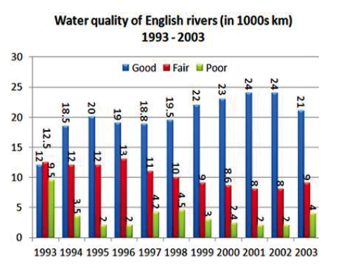
The bar chart shows the length of water that was in good, fair or poor condition each year from 1993 to 2003.
The largest increase given in the graph is from 1993 to 1994, where the amount of good quality water increased by over one third to 18,500 kilometres. A slight increase the following year was followed by a brief decline until 1998, when the length of good water increased from 19,500 kilometres to 24,000 in 2001 and 2002, although this was then followed by a drop of 3,000 km in 2003.
The length of water that was deemed to be fair quality varied between 13,000 kilometres and 8,000, with the first five years being higher each year than the second half five years.
The amount of poor water declined dramatically between 1993 and 1994, with figures falling by 6,000 kilometres, then to 2,000 kilometres for the next two years. There was a slight increase in 1997 and 1998, followed by a gradual decrease until 2002.
Overall, the length of good quality water increased while fair and poor quality both decreased.
(181 words)