
Pie Chart 1
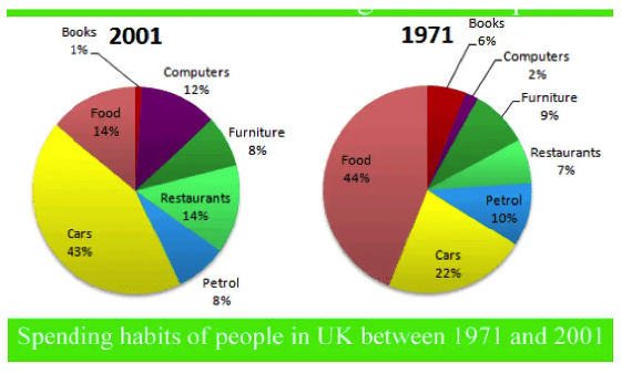
The graphs show changes in spending habits of people in the UK between 1971 and 2001. Write a report to a university lecturer describing the data.
Summarise the information by selecting and reporting the main features, and make comparisons where relevant.
Write at least 150 words
Pie Chart 2
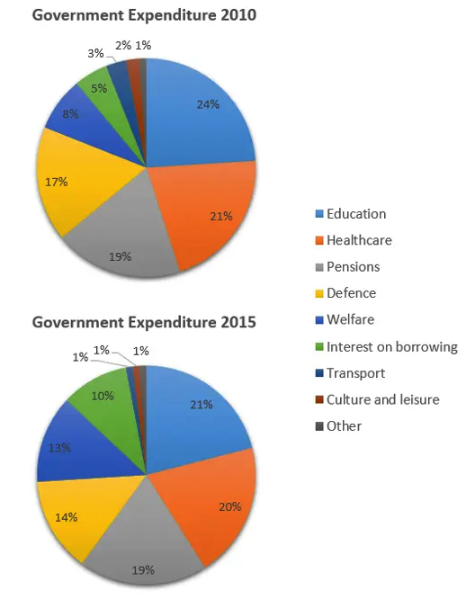
The charts below show local government expenditure in 2010 and 2015.
Summarise the information by selecting and reporting the main features, and make comparisons where relevant.
Write at least 150 words
Pie Chart 3
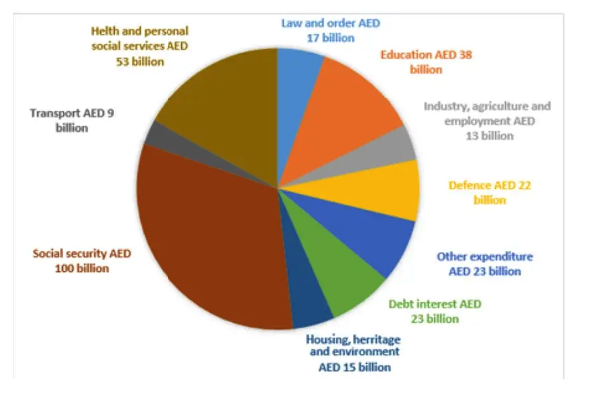
The chart below shows how much money is spent in the budget on different sectors by the UAE government in 2000.
Summarise the information by selecting and reporting the main features, and make comparisons where relevant.
Write at least 150 words
Pie Chart 4
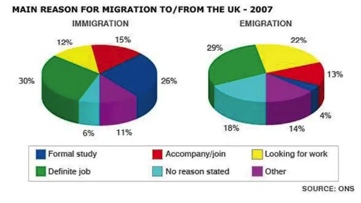
The pie charts show the main reason for migration to and from the UK in 2007.
Summarise the information by selecting and reporting the main features, and make comparisons where relevant.
Write at least 150 words
Pie Chart 5
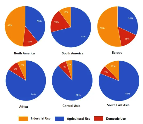
The charts below show the percentage of water used for different purposes in six areas of the world.
Summarise the information by selecting and reporting the main features, and make comparisons where relevant.
Write at least 150 words
Pie Chart 6
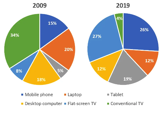
The graphs below illustrate the gadgets individuals in the 18 to 25 age categories utilized to watch TV channels in Canada in 2009 and 2019.
Summarise the information by selecting and reporting the main features, and make comparisons where relevant.
Write at least 150 words
Pie Chart 7
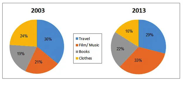
The pie charts below show the online sales for retail sectors in New Zealand in 2003 and 2013
Summarise the information by selecting and reporting the main features, and make comparisons where relevant.
Write at least 150 words
Pie Chart 8
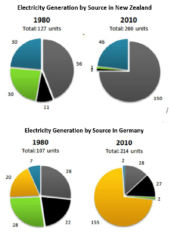
The pie charts below show electricity generation by source in New Zealand and Germany in 1980 and 2010.
Summarise the information by selecting and reporting the main features, and make comparisons where relevant.
Write at least 150 words
Pie Chart 9
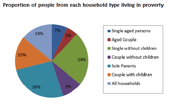
The pie chart shows the proportion of different categories of families living in poverty in the UK in 2002.
Summarise the information by selecting and reporting the main features, and make comparisons where relevant.
Write at least 150 words
Pie Chart 10
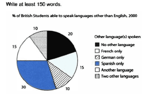
The charts below show the proportions of British students at one university in England who were able to speak other languages.
Summarise the information by selecting and reporting the main features, and make comparisons where relevant.
Write at least 150 words
Pie Chart 11
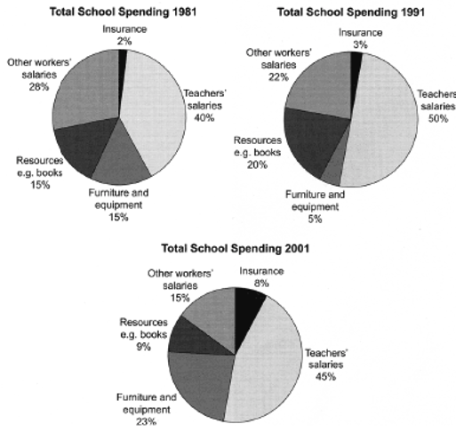
The three pie charts below show the changes in annual spending by a particular UK school in 1981, 1991 and 2001.
Summarise the information by selecting and reporting the main features, and make comparisons where relevant.
Write at least 150 words
Pie Chart 12
You should spend about 20 minutes on this task.
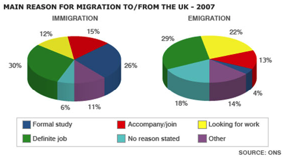
The pie charts show the main reasons for migration to and from the UK in 2007.
Summarise the information by selecting and reporting the main features and make comparisons where relevant.
Write at least 150 words.
Pie Chart 13
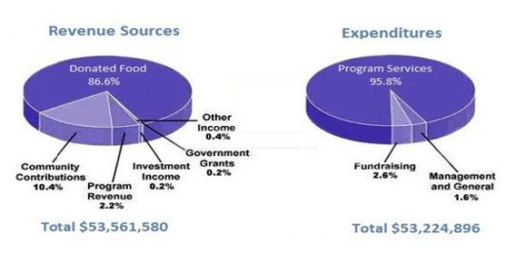
The pie chart shows the amount of money that a children’s charity located in the USA spent and received in one year.
Summarise the information by selecting and reporting the main features and make comparisons where relevant.
Write at least 150 words.
Pie Chart 14
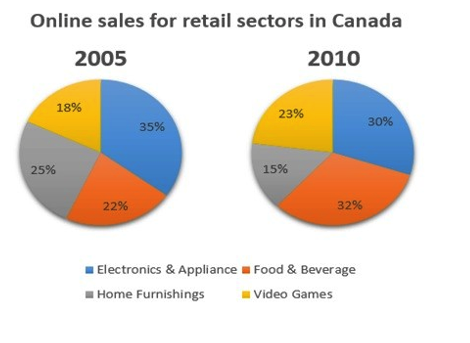
The two pie charts below show the online shopping sales for retail sectors in Canada in 2005 and 2010.
Summarise the information by selecting and reporting the main features, and make comparisons where relevant.
Pie Chart 15
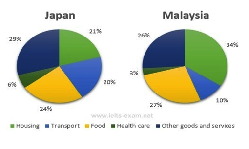
The pie charts below show the average household expenditures in Japan and Malaysia in the year 2010.
Summarise the information by selecting and reporting the main features, and make comparisons where relevant.
Write at least 150 words.
Pie Chart 16
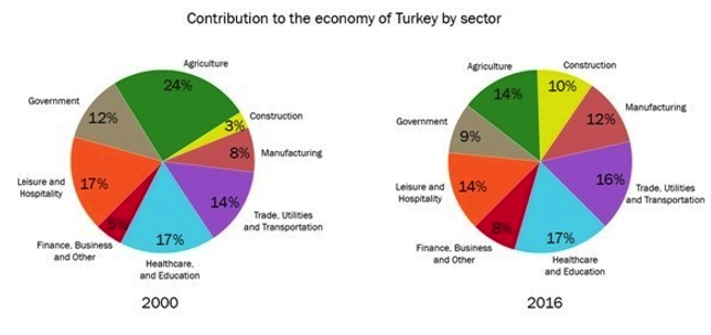
The two pie charts below show the percentages of industry sectors’ contribution to the economy of Turkey in 2000 and 2016.
Summarize the information by selecting and reporting the main features and make comparisons where relevant.
Write at least 150 words.
Pie Chart 17
The pie charts below show the comparison of different kinds of energy production of France in two years.
Summarize the information by selecting and reporting the main features and make comparisons where relevant.
Write at least 150 words.
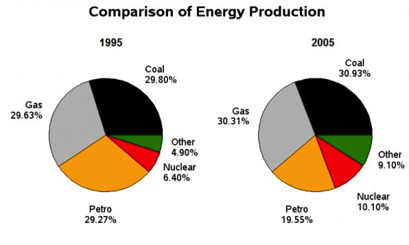
Pie Chart 18
Write a report for a university lecturer and report the main features, and make comparisons where relevant. You should write at least 150 words.
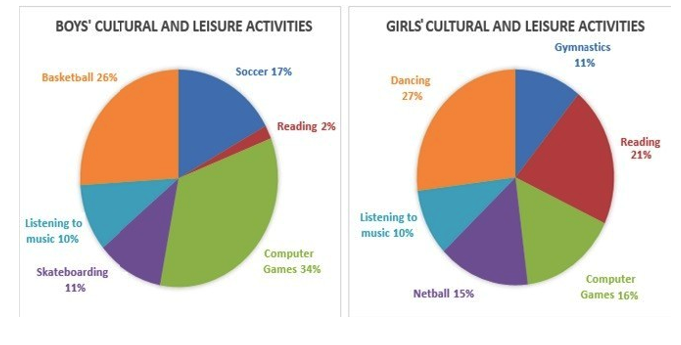
Pie Chart 19
The pie chart below shows the main reasons why students chose to study at a particular UK university in 1987 and in 2007.
Summarize the information by selecting and reporting and reporting the main features and make comparisons where relevant.
You should write at least 150 words.
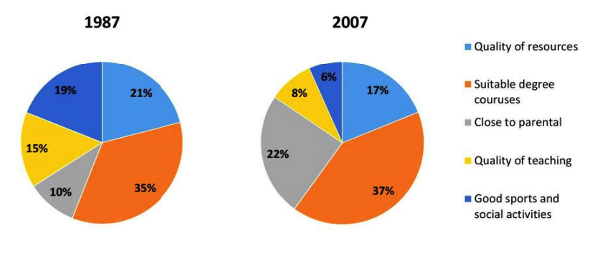
Pie Chart 20
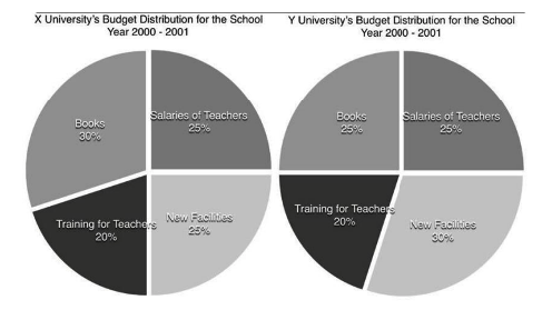
The pie chart presents the ways X university and Y university distributed their budget for the school year 2000-2001. Write at least 150 words.
Sample Answer Band 9 - 1
The table below gives information on the proportion of carbohydrates, protein and fat in three different diets.
Write a report for a university lecturer describing the information shown below. Make comparisons where relevant.
You should write at least 150 words.
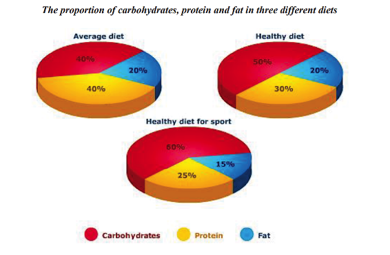
The pie charts compare the proportion of carbohydrates, protein and fat in three different diets, namely an average diet, a healthy diet, and a healthy diet for sport.
It is noticeable that sportspeople require a diet comprising a significantly higher proportion of carbohydrates than an average diet or a healthy diet. The average diet contains the lowest percentage of carbohydrates but the highest proportion of protein.
Carbohydrates make up 60% of the healthy diet for sport. This is 10% higher than the proportion of carbohydrates in a normal healthy diet, and 20% more than theproportion in an average diet. On the other hand, people who eat an average diet consume a greater relative amount of protein (40%) than those who eat a healthy diet (30%) andsportspeople (25%).
The third compound shown in the charts is fat. Fat constitutes exactly one fifth of both the average diet and the healthy diet, but the figure drops to only 15% for the healthy sports diet.
(164 words)
Sample Answer Band 9 - 2
The pie charts below show units of electricity production by fuel source in Australia and France in 1980 and 2000.
Write a report for a university lecturer describing the information shown below, and make comparisons where relevant.
You should write at least 150 words.
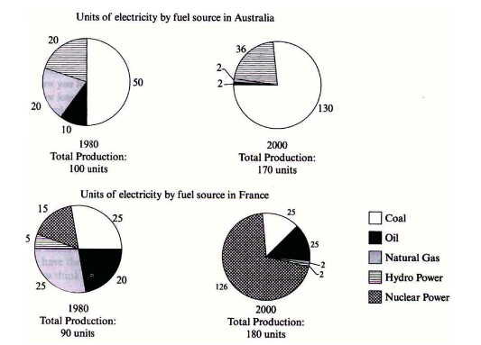
The pie charts compare the amount of electricity produced using five different sources of fuel in two countries over two separate years.
Total electricity production increased dramatically from 1980 to 2000 in both Australia and France. While the totals for both countries were similar, there were big differences in the fuel sources used.
Coal was used to produce 50 of the total 100 units of electricity in Australia in 1980, rising to 130 out of 170 units in 2000. By contrast, nuclear power became the most important fuel source in France in 2000, producing almost 75% of the country’s electricity.
Australia depended on hydro power for just well under 25% of its electricity in both years, but the amount of electricity produced using this type of power fell from 5 to only 2 units in France. Oil, on the other hand, remained a relatively important fuel source in France, but its use declined in Australia. Both countries relied on natural gas for electricity production significantly more in 1980 than in 2000.
(170 Words)
Sample Answer Band 9 - 3
The pie chart shows the amount of money that a children's charity located in the USA spent and received in one year.
Write a report for a university lecturer describing the information shown below, and make comparisons where relevant.
You should write at least 150 words.
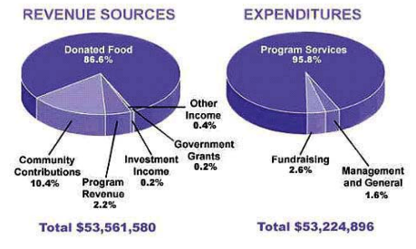
The pie charts show the amount of revenue and expenditures over a year of a children’s charity in the USA. Overall, it can be seen that donated food accounted for the majority of the income, while program services accounted for the most expenditure. Total revenue sources just exceeded outgoings.
In detail, donated food provided most of the revenue for the charity, at 86%. Similarly, with regard to expenditures, one category, program services, accounted for nearly all of the outgoings, at 95.8%.
The other categories were much smaller. Community contributions, which were the second largest revenue source, brought in 10.4% of overall income, and this was followed by program revenue, at 2.2%. Investment income, government grants, and other income were very small sources of revenue, accounting for only 0.8% combined.
There were only two other expenditure items, fundraising and management and general, accounting for 2.6% and 1.6% respectively. The total amount of income was $53,561,580, which was just enough to cover the expenditures of $53,224,896.
(Words 164)
Sample Answer Band 9 - 4
The pie charts show the electricity generated in Germany and France from all sources and renewables in the year 2009.
Write a report for a university lecturer describing the information shown below, and make comparisons where relevant.
You should write at least 150 words.
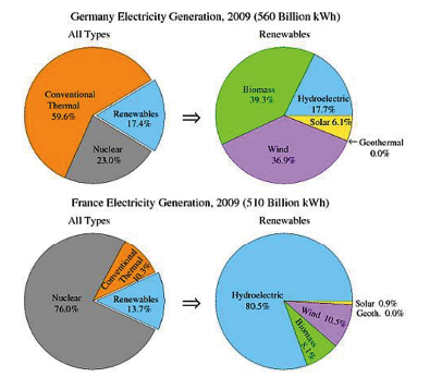
The four pie charts compare the electricity generated between Germany and France during 2009, and it is measured in billions kWh.
Overall, it can be seen that conventional thermal was the main source of electricity in Germany, whereas nuclear was the main source in France.
The bulk of electricity in Germany, whose total output was 560 billion kWh, came from conventional thermal, at 59.6%. In France, the total output was lower, at 510 billion kWh, and in contrast to Germany, conventional thermal accounted for just 10.3%, with most electricity coming from nuclear power (76%). In Germany, the proportion of nuclear power generated electricity was only one fifth of the total.
Moving on to renewables, this accounted for quite similar proportions for both countries, at approximately 15% of the total electricity generated. In detail, in Germany, most of the renewables consisted of wind and biomass, totaling around 75%, which was far higher than for hydroelectric (17.7%) and solar (6.1%). The situation was very different in France, where hydroelectric made up 80.5% of renewable electricity, with biomass, wind and solar making up the remaining 20%.
(Words 183)
Sample Answer Band 9 - 5
The pie charts show the main reasons for migration to and from the UK in 2007.
Write a report for a university lecturer describing the information shown below, and make comparisons where relevant.
You should write at least 150 words.
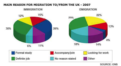
The pie charts illustrate the primary reasons that people came to and left the UK in 2007. At first glance it is clear that the main factor influencing this decision was employment.
Having a definite job accounted for 30 per cent of immigration to the UK, and this figure was very similar for emigration, at 29%. A large number of people, 22%, also emigrated because they were looking for a job, though the proportion of people entering the UK for this purpose was noticeably lower at less than a fifth.
Another major factor influencing a move to the UK was for formal study, with over a quarter of people immigrating for this reason. However, interestingly, only a small minority, 4%, left for this.
The proportions of those moving to join a family member were quite similar for immigration and emigration, at 15% and 13% respectively. Although a significant number of people (32%) gave ‘other’ reasons or did not give a reason why they emigrated, this accounted for only 17% with regards to immigration.
(173 words)
Sample Answer Band 9 - 6
The charts show the distribution of money spent on music in three different years in Northern Ireland.
Write a report for a university lecturer describing the information shown below, and make comparisons where relevant.
You should write at least 150 words.
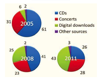
The pie charts illustrate the changes in spending patterns in Northern Ireland with
regards to music.
The first set of data is for 2003, where it can be seen that the majority of expenditure was for CDs, accounting for well over half. Just under one third of the money was spent attending concerts, standing at 31%. Downloaded music was only 6%, and the
smallest category was that labeled ‘other’.
Three years later, the order of the four categories was the same, but there was a marked increase in the sale of digital music and an inverse correlation to the sale of CDs, which fell by 20% to 41%.
By 2011, digital purchases had overtaken both concerts and CDs and accounted for nearly half of all sales. The difference between CDs and concert sales narrowed to only 2%, and the ‘other’ category rose slightly to 3%.
Overall, it is clear that while concert sales remained relatively stable at around one
third, digital music sales became more common than CD sales.
(170 words)
Sample Answer Band 9 - 7
The charts show the percentage of power generated from 6 different types in Gareline.
Write a report for a university lecturer describing the information shown below, and make comparisons where relevant.
You should write at least 150 words.

The charts illustrate the sources of power in three different periods in Gareline, with the data divided into 6 different areas.
In 1970, nearly half of all electricity was derived from hydro power, which accounted for 45% of the total. Geothermal production was slightly less than half this value, followed by wind power which created 5% of all power, with gas and the category labelled as 'other' making just over one percent each.
In 1980, the figure for hydro power had increased dramatically, making over three quarters of the total. Geothermal, wind and nuclear power created 8%, 7% and 6% respectively, with the other two categories increasing by only 0.2%.
By 1990, the trend for hydro power had reversed, with the most productive category now being geothermal power. Wind power had remained constant but there was a significant increase in electricity produced by nuclear power, accounting for 15.5%. There was a minor increase once again for wind power and the 'other' category.
In total, geothermal power and hydro power were always the most productive,
although nuclear power was increasing.
(154 words)