
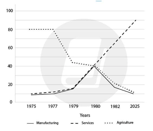
Line Graph 1
Write a report for a university lecturer describing the information in the graph below.
Summarise the information by selecting and reporting the main features, and make comparisons where relevant.
- You should write at least 150
- Allow yourself 20 minutes for this

Line Graph 2
You should spend about 20 minutes on this task.
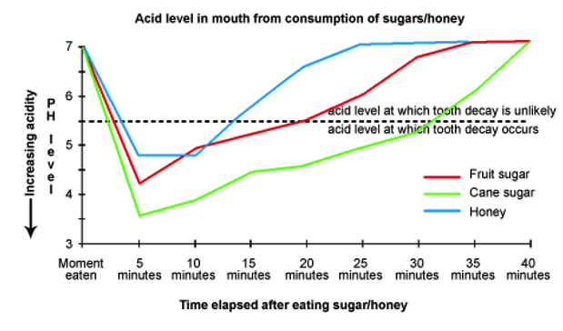
Eating sweet foods produces acid in the mouth, which can cause tooth decay. (High acid levels are measured by low pH values)
Describe the information below and discuss the implications for dental health.
Summarise the information by selecting and reporting the main features, and make comparisons where relevant.
You should write at least 150 words.
Line Graph 3
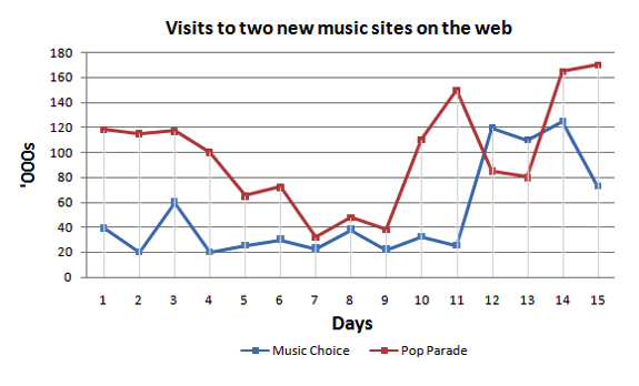
The graph below compares the number of visits to two new music sites on the web. Write a report for a university lecturer describing the information shown below.
Summarise the information by selecting and reporting the main features, and make comparisons where relevant.
You should write at least 150 words.
Line Graph 4
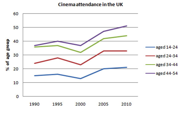
The line graph below gives information on cinema attendance in the UK. Write a report for a university lecturer describing the information given.
Summarise the information by selecting and reporting the main features, and make comparisons where relevant.
You should write at least 150 words.
Line Graph 5
You should spend about 20 minutes on this task.
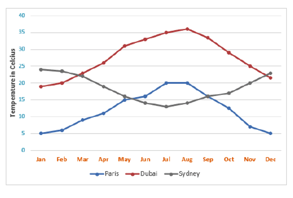
The line graph below shows the average monthly temperatures in three major cities.
Summarise the information by selecting and reporting the main features, and make comparisons where relevant.
You should write at least 150 words.
Line Graph 5
You should spend about 20 minutes on this task.
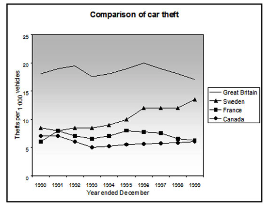
The line graph shows thefts per thousand vehicles in four countries between 1990 and 1999.
Summarise the information by selecting and reporting the main features and make comparisons where relevant.
Write at least 150 words.
Line Graph 6
You should spend about 20 minutes on this task.
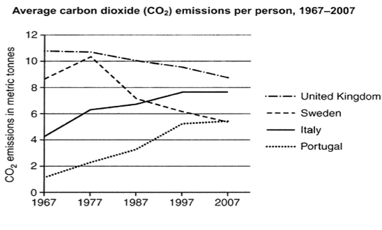
The graph below shows average carbon dioxide (Co2) emissions per person in the United Kingdom, Sweden, Italy, and Portugal between 1967 and 2007.
Summarize the information by selecting and reporting the main features, and make comparisons where relevant.
Write at least 150 words.
Line Graph 7
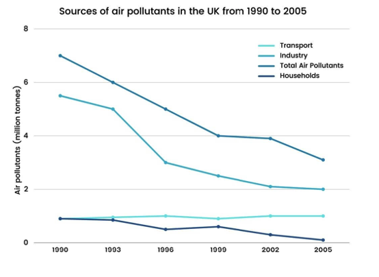
The graph below shows different sources of air pollutants in the UK from 1990 to 2005. Summarise the information by selecting and reporting the main features, and make comparisons where relevant.
Write at least 150 words
Line Graph 8
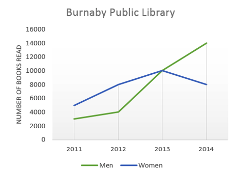
The graph below shows the number of books read by men and women at Burnaby Public Library from 2011 to 2014.
Summarise the information by selecting and reporting the main features, and make comparisons where relevant.
Write at least 150 words
Line Graph 9
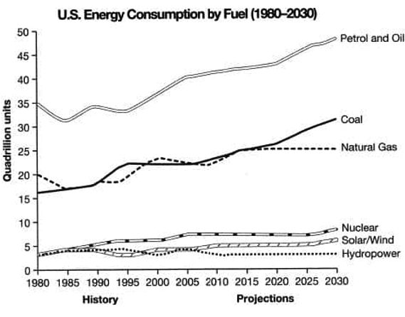
The graph below gives information from a 2008 report about energy consumption in the USA since 1980, with projections until 2030.
Summarise the information by selecting and reporting the main features and making comparisons where relevant.
Write at least 150 words
Line Graph 10
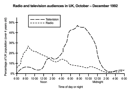
The graph below shows radio and television audiences throughout the day in 1992.
Summarise the information by selecting and reporting the main features, and make comparisons where relevant.
Write at least 150 words.
Line Graph 11
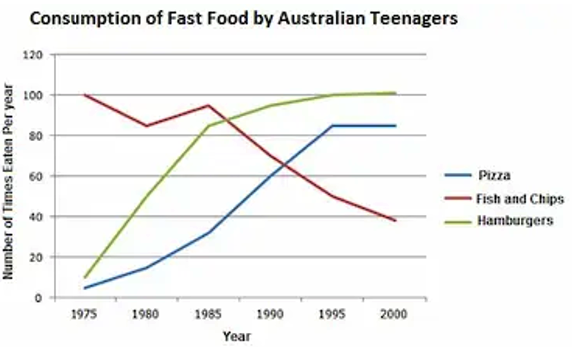
The line graph below illustrates the consumption of various fast food by youth who were born in Australia. The data were collected between 1975 and 2000.
Summarise the information by selecting and reporting the main features, and make comparisons where relevant.
Write at least 150 words.
Line Graph 12
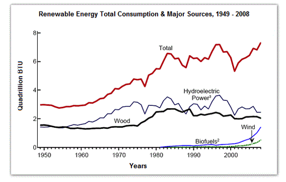
The diagram shows the consumption of renewable energy in the USA from 1949-2008. Write a 150-word report for a university lecturer identifying the main trends and making comparisons where relevant.
Summarise the information by selecting and reporting the main features, and make comparisons where relevant.
Write at least 150 words.
Line Graph 13
The graph below shows consumers’ average annual expenditure on cell phone, national and international fixed-line and services in America between 2001 and 2010.
Summarise the information by selecting and reporting the main features, and make comparisons where relevant.
Write at least 150 words.

Line Graph 14
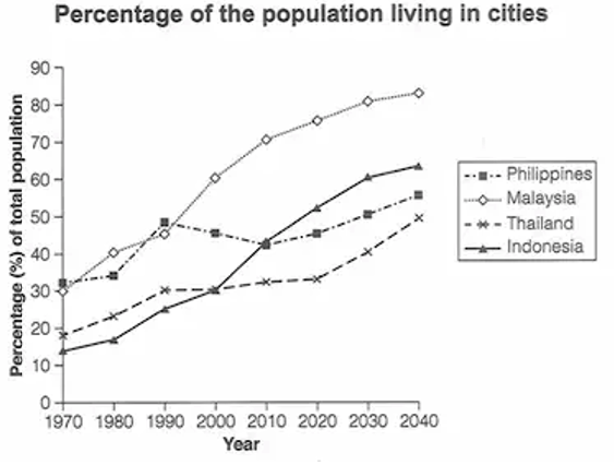
The graph below gives information about the percentage of the population in four Asian countries living in cities from 1970 to 2020, with predictions for 2030 and 2040
Summarise the information by selecting and reporting the main features, and make comparisons where relevant.
Write at least 150 words.
Line Graph 15
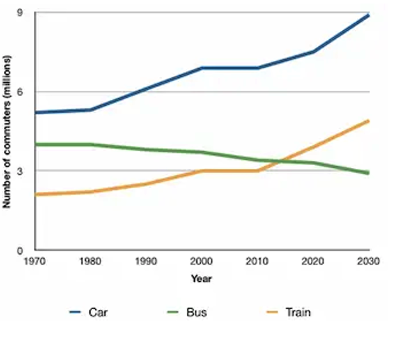
You should spend about 20 minutes on this task. The graph below shows the average number of UK commuters travelling each day by car, bus or train between 1970 and 2030. Write a report for a university, lecturer describing the information shown below.
Summarise the information by selecting and reporting the main features and make comparisons where relevant.
You should write at least 150 words.
Line Graph 16
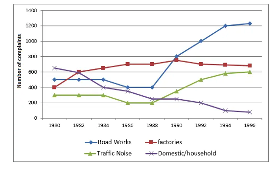
The graph below shows the number of complaints made about noise to Environmental Health authorities in the city of Newtown between 1980 and 1996.
Summarise the information by selecting and reporting the main features and make comparisons where relevant.
You should write at least 150 words.
Line Graph 17
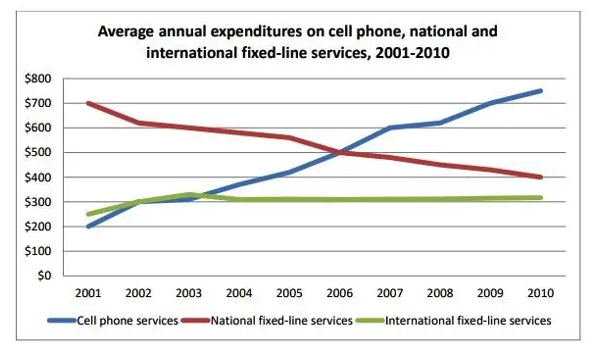
The graph below shows consumers’ average annual expenditure on cell phone, national and international fixed-line and services in America between 2001 and 2010.
Summarise the information by selecting and reporting the main features and make comparisons where relevant.
You should write at least 150 words
Line Graph 18
The graph below shows the number of tourists visiting a particular Caribbean island between 2010 and 2017.
Summarise the information by selecting and reporting the main features and make comparisons where relevant.
You should write at least 150 words

Line Graph 19
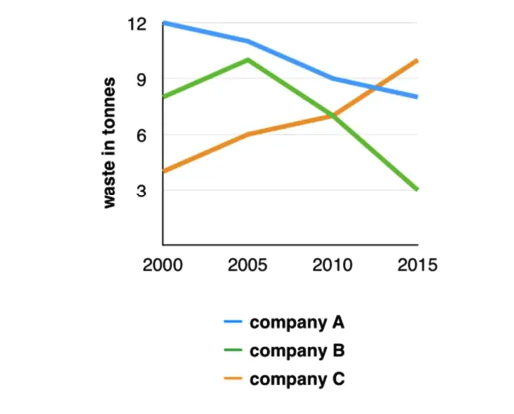
The graph below shows the amounts of waste produced by three companies over a period of 15 years.
Summarise the information by selecting and reporting the main features and make comparisons where relevant.
You should write at least 150 words
Line Graph 20
The graph below shows the number of shops that closed and the number of new shops that opened in one country between 2011 and 2018.
Summarise the information by selecting and reporting the main features and make comparisons where relevant.
You should write at least 150 words

Line Graph 21
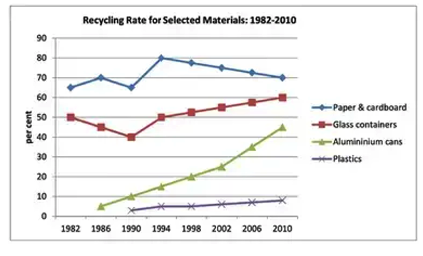
This graph shows the proportion of four different materials that were recycled from 1982 to 2010 in a particular country.
Summarise the information by selecting and reporting the main features, making comparisons where relevant.
You should write at least 150 words
Line Graph 22
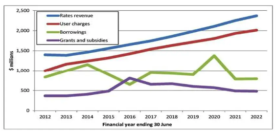
The line graph shows the past and projected finances for a local authority in New Zealand.
Summarize the information by selecting and reporting the main features and make comparisons where relevant.
Write at least 150 words
Line Graph 22
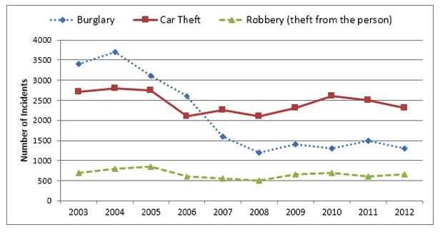
The line graph illustrates three different kind of crimes that occurred in Newport city centre between 2003 and 2012.
Summarize the information by selecting and reporting the main features and make comparisons where relevant.
Write at least 150 words
Line Graph 23
The charts below show the changes in ownership of electrical appliances and amount of time spent doing housework in households in one country between 1920 and 2019.
Summarise the information by selecting and reporting the main features, and make comparisons where relevant.
Write at least 150 words

Line Graph 24
The line chart shows trends in terms of employment in the USA in millions and predictions for the future.
Summarise the information by selecting and reporting the main features, and make comparisons where relevant.
Write at least 150 words
Line Graph 25
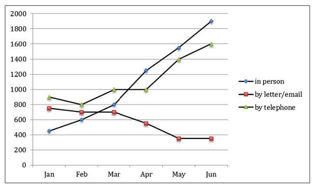
The chart shows requests for information at a tourist office in the United Kingdom from January to June.
Summarise the information by selecting and reporting the main features, and make comparisons where relevant.
Write at least 150 words
Line Graph 26
The line chart shows average attendance at the cinema among various age groups in the US from 2000 to 2011.
Summarise the information by selecting and reporting the main features, and make comparisons where relevant.
Write at least 150 words

Line graph 27
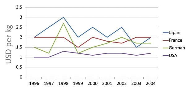
The line graph shows the sales figures for bananas imported to 4 countries from 1996 to 2004.
Summarise the information by selecting and reporting the main features, and make comparisons where relevant.
Write at least 150 words
Line Graph 28
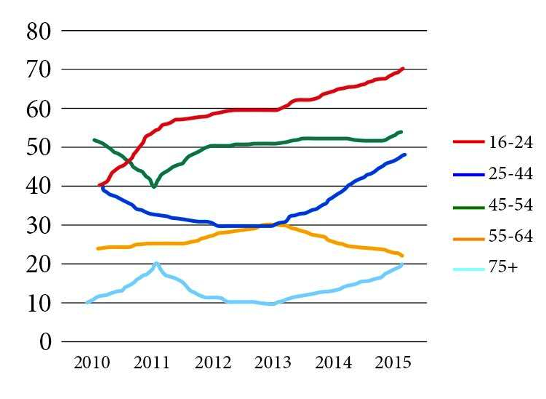
The graph below shows the percentage of people in different age groups in one city who attended music concerts between 2010 and 2015.
Summarise the information by selecting and reporting the main features, and make comparisons where relevant.
Write at least 150 words
Line Graph 29
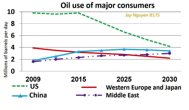
The graph below shows oil use of major consumers in 4 countries from 2009 to 2030.
Summarise the information by selecting and reporting the main features, and make comparisons where relevant.
Write at least 150 words
Line Graph 30
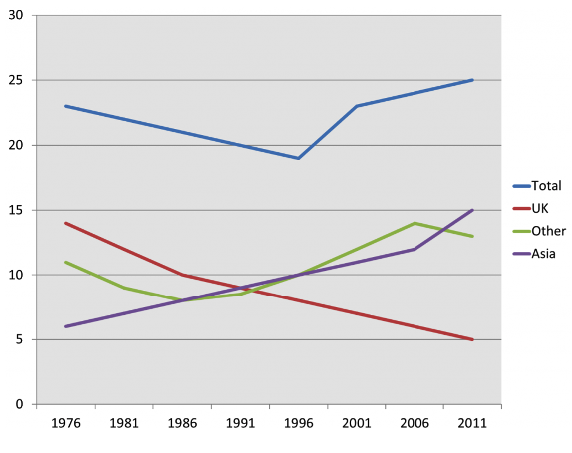
The line chart details the proportion of residents living in Australia in millions from different regions between 1976 and 2011.
Summarise the information by selecting and reporting the main features, and make comparisons where relevant.
Write at least 150 words
Sample Answer Band 9 - 1
The table below gives information on UK acid rain emissions, measured in millions of tonnes, from four different sectors between 1990 and 2007.
Write a report for a university lecturer describing the information shown below.
Make comparisons where relevant.
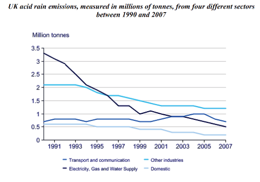
The line graph compares four sectors in terms of the amount of acid rain emissions that they produced over a period of 17 years in the UK.
It is clear that the total amount of acid rain emissions in the UK fell considerably between 1990 and 2007. The most dramatic decrease was seen in the electricity, gas and water supply sector.
In 1990, around 3.3 million tonnes of acid rain emissions came from the electricity, gas and water sector. The transport and communication sector was responsible for about 0.7 million tonnes of emissions, while the domestic sector produced around 0.6 million tonnes. Just over 2 million tonnes of acid rain gases came from other industries.
Emissions from electricity, gas and water supply fell dramatically to only 0.5 million tonnes in 2007, a drop of almost 3 million tonnes. While acid rain gases from the domestic sector and other industries fell gradually, the transport sector saw a small increase in emissions, reaching a peak of 1 million tonnes in 2005. (169 words)
Sample Answer Band 9 - 2
The table below gives information on households with a regular use of a car in Great Britain from 1971 to 2007.
Write a report for a university lecturer describing the information shown below. Make
comparisons where relevant.
You should write at least 150 words.
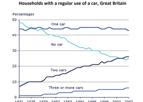
The graph shows changes in the number of cars per household in Great Britain over a period of 36 years.
Overall, car ownership in Britain increased between 1971 and 2007. In particular, the
number of households with two cars rose, while the number of households without a car fell.
In 1971, almost half of all British households did not have regular use of a car. Around 44% of households had one car, but only about 7% had two cars. It was uncommon for families to own three or more cars, with around 2% of households falling into this category.
The one-car household was the most common type from the late 1970’s onwards, although there was little change in the figures for this category. The biggest change was seen in the proportion of households without a car, which fell steadily over the 36-year period to around 25% in 2007. In contrast, the proportion of two-car families rose steadily, reaching about 26% in 2007, and the proportion of households with more than two cars rose by around 5%. (176 Words)
Sample Answer Band 9 - 3
The graph below gives information about internet users in three countries between 1999 and 2009.
Write a report for a university lecturer describing the information shown below. Make
comparisons where relevant.
You should write at least 150 words.
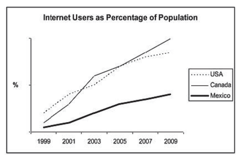
The line graph compares the percentage of people in three countries who used the Internet between 1999 and 2009.
It is clear that the proportion of the population who used the Internet increased in each
country over the period shown. Overall, a much larger percentage of Canadians and Americans had access to the Internet in comparison with Mexicans, and Canada experienced the fastest growth in Internet usage.
In 1999, the proportion of people using the Internet in the USA was about 20%. The figures for Canada and Mexico were lower, at about 10% and 5% respectively. In 2005, Internet usage in both the USA and Canada rose to around 70% of the population, while the figure for Mexico reached just over 25%.
By 2009, the percentage of Internet users was highest in Canada. Almost 100% of Canadians used the Internet, compared to about 80% of Americans and only 40% of Mexicans.
(151 Words)
Sample Answer Band 9 - 4
The graph below shows the proportion of the population aged 65 and over between 1940 and 2040 in three different countries.
Write a report for a university lecturer describing the information shown below. Make
comparisons where relevant.
You should write at least 150 words.
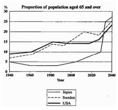
The line graph compares the percentage of people aged 65 or more in three countries over a period of 100 years.
It is clear that the proportion of elderly people increases in each country between 1940 and 2040. Japan is expected to see the most dramatic changes in its elderly population.
In 1940, around 9% of Americans were aged 65 or over, compared to about 7% of Swedish people and 5% of Japanese people. The proportions of elderly people in the USA and Sweden rose gradually over the next 50 years, reaching just under 15% in 1990. By contrast, the figures for Japan remained below 5% until the early 2000s.
Looking into the future, a sudden increase in the percentage of elderly people is predicted for Japan, with a jump of over 15% in just 10 years from 2030 to 2040. By 2040, it is thought that around 27% of the Japanese population will be 65 years old or more, while the figures for Sweden and the USA will be slightly lower, at about 25% and 23% respectively.
(178 words)
Sample Answer Band 9 – 5
The graph shows the average annual expenditure on cell phone and residential phone services.
Write a report for a university lecturer describing the information shown below. Make
comparisons where relevant.
You should write at least 150 words.
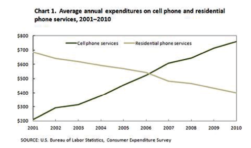
The line graph compares average yearly spending by Americans on mobile and landline phone services from 2001 to 2010.
It is clear that spending on landline phones fell steadily over the 10-year period, while mobile phone expenditure rose quickly. The year 2006 marks the point at which expenditure on mobile services overtook that for residential phone services.
In 2001, US consumers spent an average of nearly $700 on residential phone services, compared to only around $200 on cell phone services. Over the following five years, average yearly spending on landlines dropped by nearly $200. By contrast, expenditure on mobiles rose by approximately $300.
In the year 2006, the average American paid out the same amount of money on both types of phone service, spending just over $500 on each. By 2010, expenditure on mobile phones had reached around $750, while the figure for spending on residential services had fallen to just over half this amount.
(162 words)
Sample Answer Band 9 – 6
The graph below shows the average number of UK commuters travelling each day by car, bus or train between 1970 and 2030.
Write a report for a university lecturer describing the information shown below. Make
comparisons where relevant.
You should write at least 150 words.
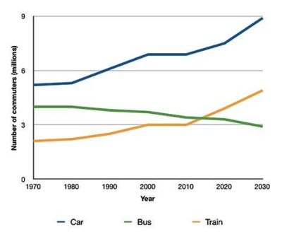
The line graph compares figures for daily travel by workers in the UK using three different forms of transport over a period of 60 years.
It is clear that the car is by far the most popular means of transport for UK commuters throughout the period shown. Also, while the numbers of people who use the car and train increase gradually, the number of bus users falls steadily.
In 1970, around 5 million UK commuters travelled by car on a daily basis, while the bus and train were used by about 4 million and 2 million people respectively. In the year 2000, the number of those driving to work rose to 7 million and the number of commuting rail passengers reached 3 million. However, there was a small drop of approximately 0.5 million in the number of bus users.
By 2030, the number of people who commute by car is expected to reach almost 9 million, and the number of train users is also predicted to rise, to nearly 5 million. By contrast, buses are predicted to become a less popular choice, with only 3 million daily users.
(188 words)
Sample Answer Band 9 - 7
The line graph below shows changes in the amount and type of fast food consumed by Australian teenagers from 1975 to 2000.
Write a report for a university lecturer describing the information shown below. Make
comparisons where relevant.
You should write at least 150 words.
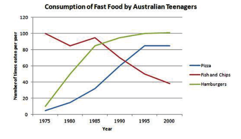
The line graph illustrates the amount of fast food consumed by teenagers in Australia
between 1975 and 2000, a period of 25 years.
Overall, the consumption of fish and chips declined over the period, whereas the amount of pizza and hamburgers that were eaten increased.
In 1975, the most popular fast food with Australian teenagers was fish and chips, being eaten 100 times a year. This was far higher than Pizza and hamburgers, which were consumed approximately 5 times a year. However, apart from a brief rise again
from 1980 to 1985, the consumption of fish and chips gradually declined over the 25
year timescale to finish at just under 40 times per year.
In sharp contrast to this, teenagers ate the other two fast foods at much higher levels. Pizza consumption increased gradually until it overtook the consumption of fish and chips in 1990. It then leveled off from 1995 to 2000. The biggest rise was seen in hamburgers, increasing sharply throughout the 1970’s and 1980’s, exceeding fish and chips consumption in 1985. It finished at the same level that fish and chips began, with consumption at 100 times a year.
(191 words)
Sample Answer Band 9 - 8
The line graph illustrates the amount of spreads consumed from 1981 to 2007, in grams.
Write a report for a university lecturer describing the information shown below. Make
comparisons where relevant.
You should write at least 150 words.
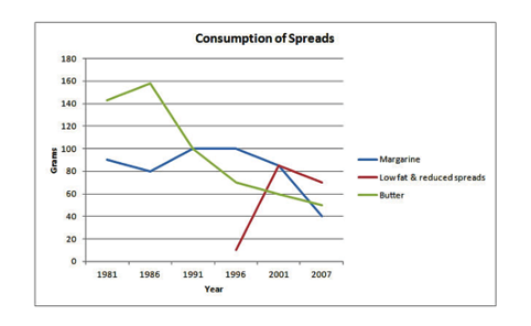
The graph shows the quantity of margarine, low fat spreads and butter consumed between 1981 and 2007. The quantities are measured in grams. Over the period 1981 to 2007 as a whole, there was a significant decrease in the consumption of butter and margarine and a marked increase in the consumption of low fat-fat
spreads.
Butter was the most popular fat at the beginning of the period, and consumption reached a peak of about 160 grams per person per week in about 1986. After this, there was a sharp decline.
The consumption of margarine began lower than that for butter at 90 grams. Following this, in 1991, it exceeded that of butter for the first time, but after 1996 there was a steady downward trend in the amount consumed, which seemed set to continue.
Low–fat spreads were introduced in 1996, and they saw a significant rise in their consumption from that time, so that by about 2001 they were more popular than either butter or margarine.
(167 words)
Sample Answer Band 9 - 9
The line graph shows the number of first time visitors and returning visitors
who visited Caryl Island from 2000 to 2008.
Write a report for a university lecturer describing the information shown below. Make
comparisons where relevant.
You should write at least 150 words.
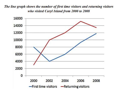
The line graph depicts the number of people who visited Caryl Island over an 8 year period from 2000, with data given in two yearly increments.
In 2000, the number of people who visited the destination for the first time was approximately 8,000 per annum, compared with only about 3,000 returning visitors. However, by 2002, this trend had reversed, with slightly more than 4,000 new visitors compared to nearly 10,000 returning visitors.
From 2002 to 2006, both returning and first time visitor numbers increased dramatically rising to a combined total of well over 24,000 visitors.
While the combined number of people visiting the island remained high in 2008, the variation between first time and returning visitors narrowed as the number of people on their first visit continued to increase while those coming back for additional visits fell.
In total, it is evident that the number of people visiting Caryl island increased significantly over the period given.
(156 words)
Sample Answer Band 9 – 10
The line graph shows the average temperature during the hottest part of the day in Australia in 2007.
Write a report for a university lecturer describing the information shown below. Make
comparisons where relevant.
You should write at least 150 words.
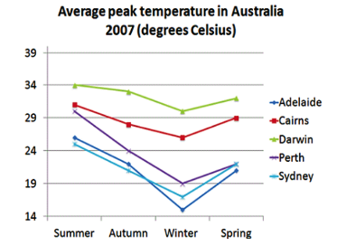
The line graph shows changes in median highest temperatures in 5 cities in Australia in different seasons in 2007.
Throughout the graph, Darwin was always the hottest place, with an average temperature of 34 degrees Celsius in summer. Darwin was also notable in that the fall in temperature between summer and autumn was the smallest decrease between seasons of any of the cities that year, sinking to only about 33 degrees.
Cairns and Perth were the next warmest cities shown, although Perth was markedly cooler than Perth in autumn and winter, falling to approximately 19 degrees in the coolest season.
Sydney and Adelaide had similar temperatures in summer and autumn, with only a degree between them, but in winter, Adelaide fell below Sydney to become the coldest place illustrated. Sydney, Adelaide and Perth all had comparable temperatures in spring.
Overall, it can be seen that in 2007, temperatures in these cities in Australia ranged from approximately 34 degrees to 15 degrees at their average hottest point.
(166 words)
Sample Answer Band 9 – 11
The graph shows the hours spent in different study methods during a two year course.
Write a report for a university lecturer describing the information shown below. Make
comparisons where relevant.
You should write at least 150 words.
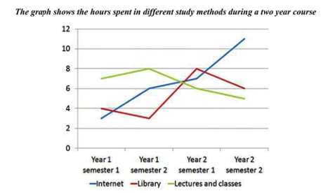
The graph shows the number of weekly hours spent studying in the library, with a tutor or lecturer or using the internet during a 2 year course.
The most striking trend is that there is a dramatic increase in the use of the internet throughout the period, especially between the first and second semesters of each year, with hours increasing from about 3 at the beginning of the course to over 10 by the end.
Hours spent in a classroom or lecture situation was initially the highest at approximately 7 hours a week, increasing to 8 hours in the second semester of the first year. However, the figure fell during the second year to finish at only 5 hours a week.
Time in the library was the most fluctuating, initially falling from 4 hours down to about 3 hours, then rapidly increasingly to 8 hours before once again declining to end at about 6 hours.
Overall, use of the internet increased while time in class and lectures declined and time in the library varied.
(174 words)